Creating a better advantage for Advantage Manufacturing


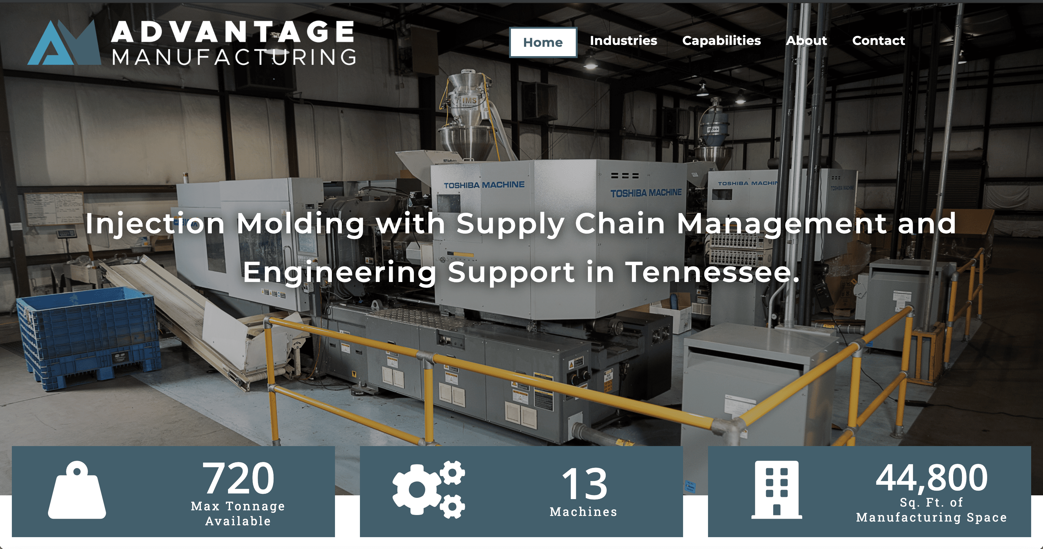
Back in mid-2020, we had our first opportunity to work with Advantage Manufacturing, a leading producer of injection molded plastic components located in Friendship, TN. For that first project we worked their team with them to create an updated sales deck, complete with photography, logo package, and custom graphics. 


After that successful pandemic project, the Advantage Manufacturing team realized their need for a functional and updated website. With the success of our first project together, Director of Business Development, Chris Stiller came back to our team to develop a new online presence. 

While we had the benefit of already having a recently updated photography portfolio of products, we rounded it out with new headshots of leadership positions, equipment, and behind the scenes on the factory floor. By capturing high quality photography, we were able to create a visually appealing website for Advantage, even though it is a typical factory setting.
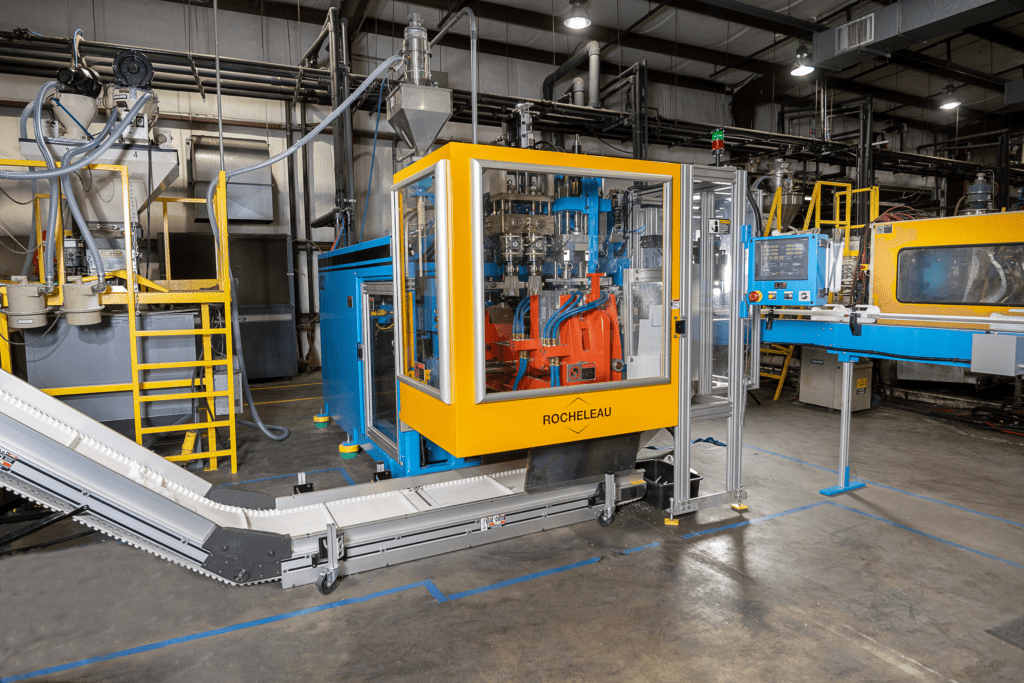
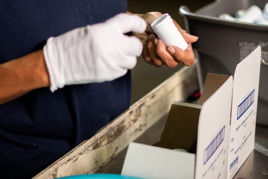
As an injection molding manufacturer with supply chain management, Advantage appeals to a wide range of customers – from firearms manufactures to disposable medical products to non-decorative automotive parts. Understanding all of these potential customers of OUR customer affected the way we designed the site for Advantage and we are excited to have launched a website for them to appeal to all. 

Are you ready to launch a new website for your business? Schedule a meeting with us today! 

Client Spotlight: Mack Pest Control’s New Site

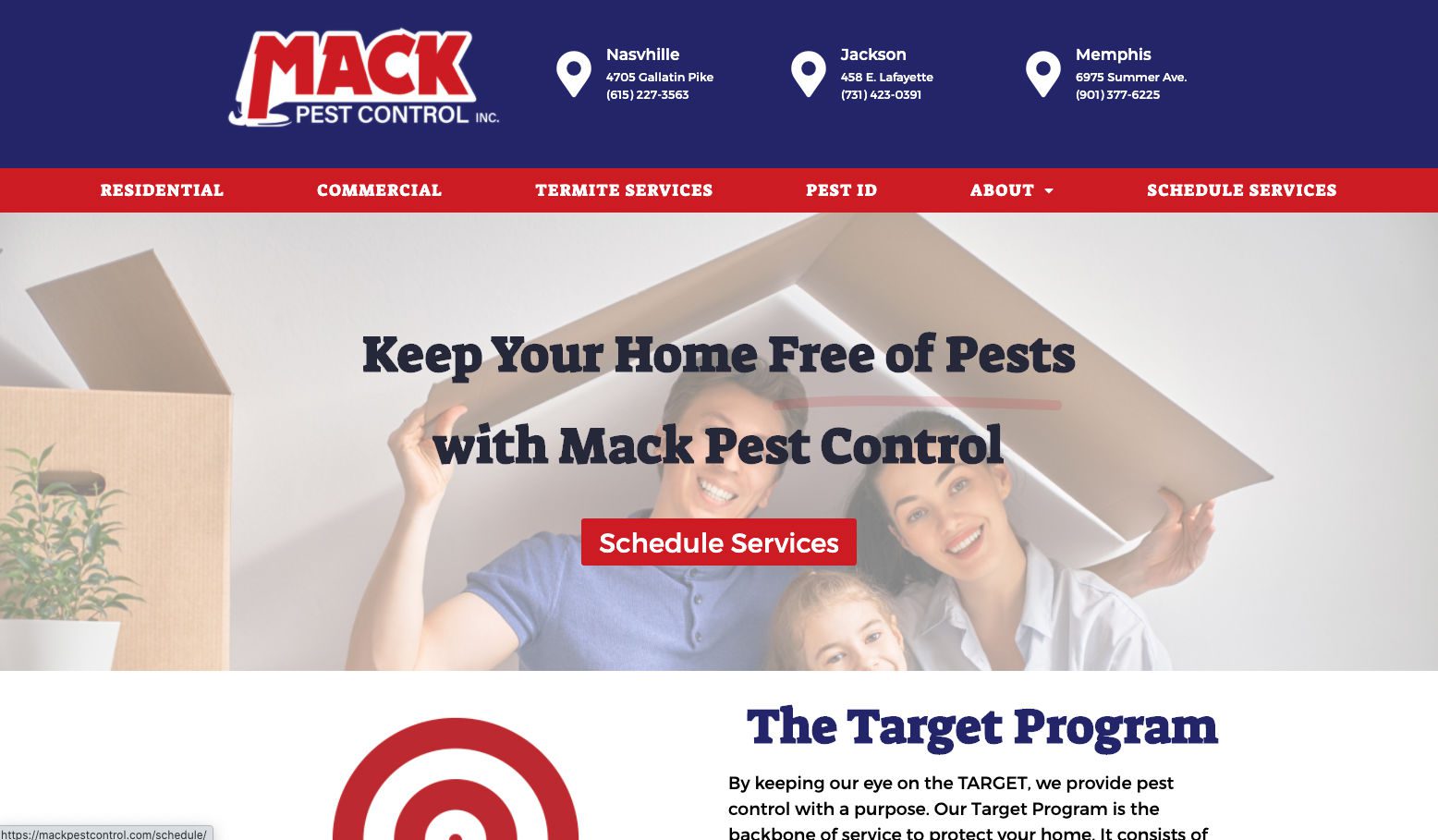
We are excited to announce the launch of the new website for Mack Pest Control.

Mack Pest Control is a local company steeped in history with three generations working in the business. When working with Mack Pest Control to help determine the best way to communicate their value proposition, we focused on their knowledge.

Mack keeps two entomologists on staff to create plans to prevent pest problems and deal with issues that other firms might miss. Two programs that they have that are unique are the Target Program and the Pest ID Program. With the Target Program, they examine your home or business and develop a plan that is preventative instead of reactive. The Pest ID Program allows people to submit a picture to help identify the bug that is bothering them!

Click below to see the entire Mack Pest Control site!

Mack Pest Control Site

Website Content – Where Do You Start?

Brainstorming Session

We’ve said it before – websites are no longer an optional part of a business. They give you the unique opportunity to present information to your customers and potential customers when they research and compare you to your competitors. Without stellar content, the time your potential customers spend on your website could be a waste.

Creating awesome website content is a process that starts with a good plan. Whether you are creating a new website or updating an existing website, you should complete an evaluation of your organization before digging in and composing your content. Each time we meet with a potential new client, and even when we recently updated our own website, we start with these five questions.

Recently, we worked with ASPELL Recovery Center here in West Tennessee and began with this same process to find out what information was crucial to include on their new website. We also have a number of other new websites in development, so keep an eye out for those launching in the coming months.

Do you know your organization?

  • What is your company’s history? To clearly communicate who you are to others, you need to know who you are. Spend time with your management teams and employees talking about your past, present, and future as an organization.
  • Do you have a Mission or Vision Statement? If you do have one, make sure these statements identify who you are as a company. If you do not have one, consider crafting one before launching or relaunching your site.

What makes your organization unique?

  • What do you do, that others don’t? Why would you be chosen over your competitors?
  • There is always something that makes us unique from others. It is essential to identify that in order to show your customers why your business is the better choice. Once you know this aspect of your company, you are ready to tell the world!

Who are your competitors?

  • Name your top competitors – those whom you compete directly with for business on a daily basis.
  • Competition drives us to be better. Knowing your competition helps you better determine your strengths and weaknesses. You are also better prepared to make your company stand out, instead of blending into what everyone else is doing.

Who are your customers?

  • Is it a busy, working mom? A retired couple? A College student?
  • By knowing who your customers are, you can clearly understand and communicate what you do to make their lives better. That message needs to be conveyed immediately. Don’t make your customers search for what you do!

What is the goal of the website?

  • What do you want your customer to do?
  • Make sure to develop a clear Call to Action (CTA). People need to know what you want them to do on your website. Do you want them to buy something? Do you want them to schedule an appointment? Make it clear and make the buttons easy to find and click.

Anyone can put up a website, but one with carefully planned out content that is relevant to your industry, up-to-date, and easy to navigate is a different story. Taking the time to do this will always have you a step ahead of the competition. By spending time on quality content, your website will be at the top of search pages without spending extra advertising dollars.

Ready to conquer a new website but need additional guidance? Make sure to download a copy of our Digital Marketing Checklist and then schedule a meeting with one of our experts here at Adelsberger Marketing. That’s what we are here for. Click below and we’ll get started.


Client Spotlight: BizTech Roadshow

If you haven’t heard by now, Adelsberger Marketing and theCO are in the middle of a 15 county tour of West Tennessee with Kevin getting a chance to speak at all the stops and theCO bus showing off the latest in technology. We have had great turnouts so we wanted to take a look at the components that have gone into making the event successful.

  1. Cool Branding: Katie Howerton of Our Jackson Home and theCO put together a great brand to make the tour folks look cooler than we really are. This brand has been implemented across all of our components to give a unified feel to the marketing. 
  2. A great place to find out more: We created a simple but branded website to help direct people to find out more. BizTechRoadshow.com has a video explaining what the tour is and provides information about each of our tour stops that are open to the public. We chose to leave the details off there to help make the site more streamlined. We put the details on Facebook events that were created for each county that was open to the public.
  3. Facebook Events: We created Facebook events for each of the stops. We really like using Facebook events because it helps create a reminder system that people are native to. If you RSVP for an event on Facebook, it opens you up to additional communication from us. This means we can send you reminders and notes about the event. Facebook will also send reminders the day of the event which will help people to remember.
  4. Facebook Video: We created videos for almost every stop on the tour, depending if they are open to the public or not. We did this in a way that allowed to us to use some parts of the video multiple times to cut down on editing and shooting time. Each of these videos is specific for the county that we are visiting so our local partners are able to share a video that is talking about their specific location. It was worth the extra time to do custom videos because people like to feel like they are being talked to specifically not generally.
  5. Facebook Ads and Retargeting: We have run a good amount of ads for each location on the tour. We have been able to target folks via Facebook based on interests that they have in Entrepreneurship and Social Media. Additionally, we target folks who have shown interest in the event with messages saying: “There is still time to RSVP.” These have been effective.
  6. Local Partnerships: The most important part of the tour is the local partnerships to execute these events. Having these events with a local entity, mostly chambers, gives us added credibility as we go into a town to talk. We are also providing in demand content which in turn helps the chamber seem more valuable to their members.  It is a win-win for sure!

We have a few more stops left and we hope to see you come out to the BizTech Roadshow!

Client Spotlight: First Presbyterian Church

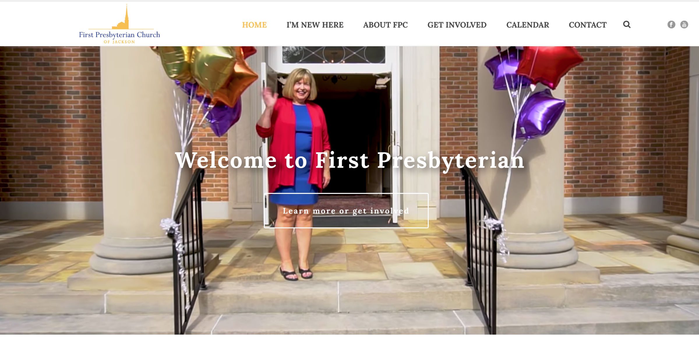
We recently completed a website for First Presbyterian Church of Jackson Tennessee. The staff and lay folks felt it was time for an internet Facelift so we went to work!

They already had a strong brand so we just needed to give the website an updated look. This included writing new copy, doing a photo shoot on a Sunday, and recording a new welcome message from the pastor. It also led them to work on a new system to stream and log their services. This component was done in partnership with Cody Cunningham.

First Pres takes their history seriously so we worked that into the new site. We also worked to streamline the menu navigation and bring a responsive element to the site which had been lacking. We also built the site on WordPress to make content updates easy for the staff as they continue their progress into the future.

Check it out here. 


Customer Spotlight: Care Center

We love nonprofits at Adelsberger Marketing. My (Kevin) background is from nonprofits. It’s even better when that nonprofit does work to expand the work of the kingdom of God! The Care Center fills a very specific and important niche in Jackson and West Tennessee. We had the pleasure to work with Nathan Young, Director of the Care Center and his board members to create a new website and two videos for their Christmas Banquet.

You can check out the website here: https://www.carecenterofjackson.org/  (Photography provided by www.leleandbeane.com)

You can watch one of the videos here:

If you are interested in getting more involved with the Care Center, check out the “Ways to Help” page on their website.

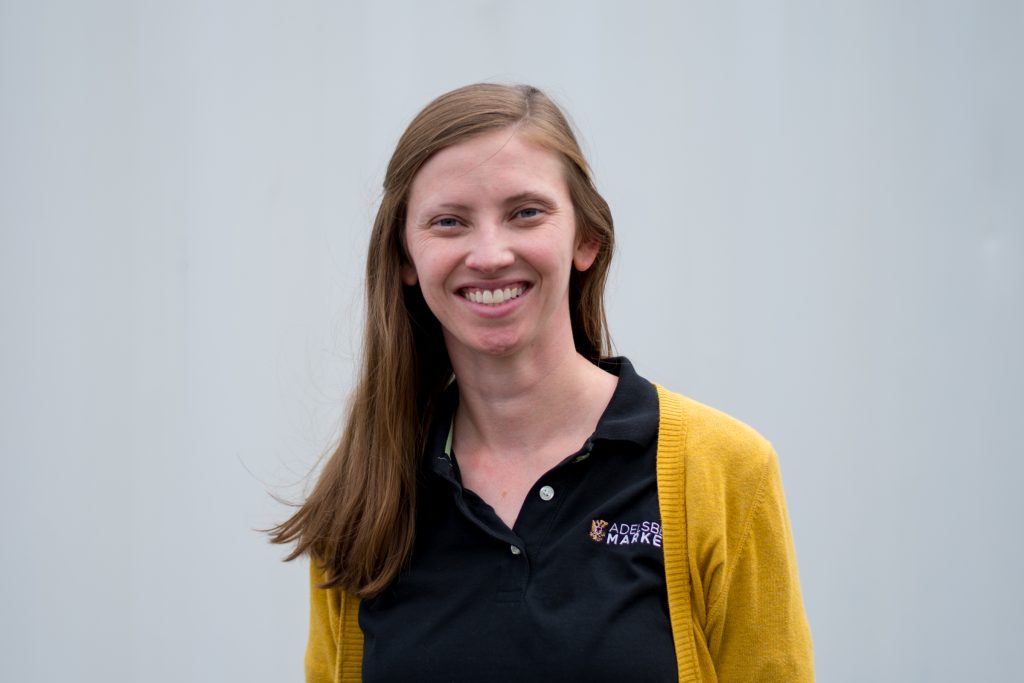
New Employee Introduction: Renae Adelsberger

I still remember the day – well, not the time and date exactly – but the emotions and scenario. My father was on the back patio throwing water balloons at our roof. I walked outside to find out what was happening. He had filled them with bleach in an attempt to get the black mold stains off our roof. He thought it was brilliant; I thought he was crazy.

Little did I know, that moment in my dad’s history changed my family’s future. He decided to begin his own Roof and Exterior Cleaning company. I spent the rest of my teenage years in the middle of the business. My first job was to help pressure wash and seal decks and patios. On the weekends, I helped mom with paperwork. The business was central to our lives. Everyone had a role that we each learned to perform.

During these years, I fell in love with small businesses in the community. I learned firsthand how much of a family’s life is devoted to them. So when Kevin began tinkering with marketing for small businesses, I supported him. In the beginning, he worked for free food until, one night, I had to put my foot down and say, “no more Mexican restaurants! I can’t eat any more tacos!”

Continue reading

Client Spotlight: Don Polley and Associates

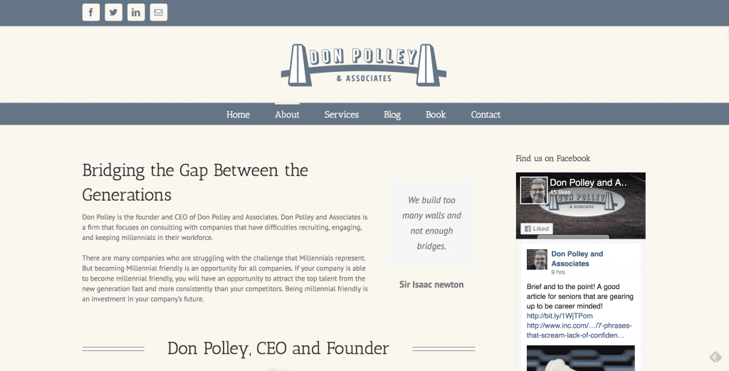
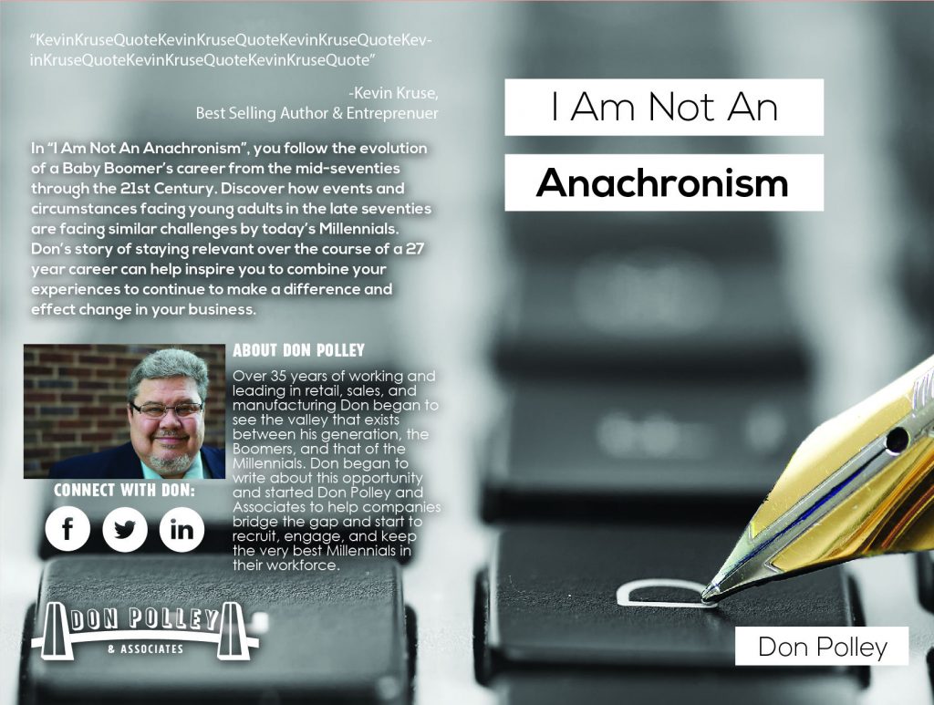
I recently finished a project for a startup Don Polley and Associates. The elements of the project were:

Branding, Website, Print Materials, Headshots, Videography, And a book!

I really enjoyed this project because I was able to use the width of my skillset to deliver for this client!

Don Polley was starting a business that needed to communicate professionalism to Human Resource managers and their leadership across industries. We started off with a brand that would help convey that Don was there to build bridges across the generational divide.


We followed that up with printed material to help distribute to a potentially older demographic and something he could leave with potential customers. See the flyer (front and back) and the business card (front and back).

Don needed some professional photography to help make sure he looked professional to his potential clients.

We also wanted to make sure the brand was up to snuff with the digital age because Don works with Millenials. We created a responsive website that featured a blog where Don can demonstrate his knowledge.

Don also saw video as an important part of marketing in 2017. So we created a short video of him explaining what the business was all about:

We also published an autobiography of Don’s and got it placed on Amazon. 

This was a great project and Don was an exceptional client. I have worked with few clients that defer to expertise as quickly and graciously. If you need help building a relationship with Millenials in your workplace, Don is the guy to talk to!

Client Spotlight: Wright Law

This month I draw attention to Pam Wright and her specialty law practice, Wright Law. Pam recently struck out on her own  after a long career in law with a nonprofit firm. After meeting with Pam I knew that I would be able to help becuase it was clear that she knew what she was talking about and interested in using the latest tech to do so. It’s important to remember that marketing can not help a stone roll uphill but it can help a stone roll downhill twice as fast.

Pam is the only Certified Elder law attorney in our area. She is an expert in helping families transition as members become elderly and need more care. If it has to do with ageing or special needs law, she is the person to call.

Marketing for attorneys is always a little tricky becuase: 1. They often need to be formal, 2. There are a lot of rules restricting their marketing and 3. They are extremely busy folks.

This project had a few major components. First, design a brand that would represent the firm to the community. This simple logo will work in all applications and be clearly communicate the name of the firm to the community:


WL-Blue-01


We also took headshots of Pam:

pwright-01-5

We created brochures to leave at targeted institutions in town:

Front of the Brochure

Back of the Brochure

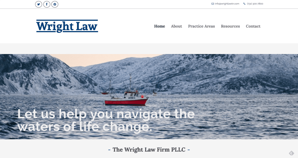
But the crux of the project was the website. One of the interesting parts of the project was creating the glossary of terms to help educate Pam’s customers. Here is a link to the website.

Screen Shot 2016-06-28 at 8.26.33 AM-w1200-h1200


Client Spotlight: Josh Dougan Law

Josh Dougan Law

Josh Dougan approached me about making a website for his law firm, Dougan Law. We worked through the needs of his firm for the website. I built a site map and planned the visual layout while Josh prepared the copy for the site. I made a few revision suggestions and once approved, I was off to build the website.

We also needed to take a headshot of Josh for the website. Downtown Jackson has some great spots for taking photos and we got this one on the corner of Main and Liberty.

Josh Dougan Law

You can visit the website here:

Josh Dougan law Website