Client Spotlight: La Petite Boutique

Queen Bees

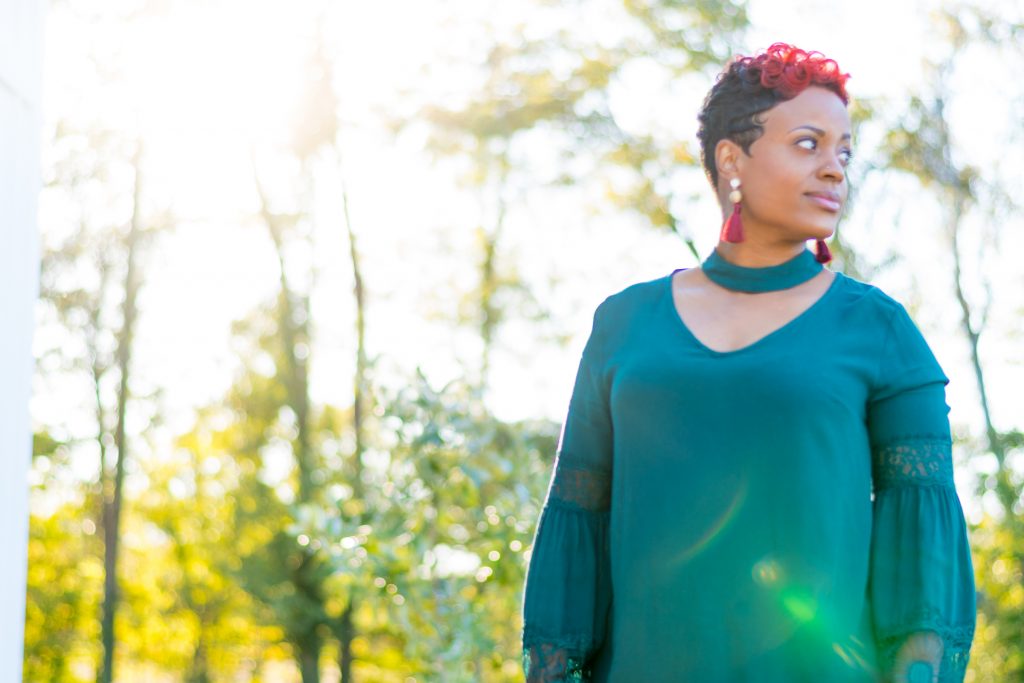
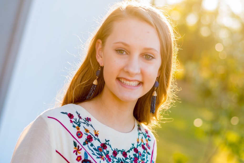
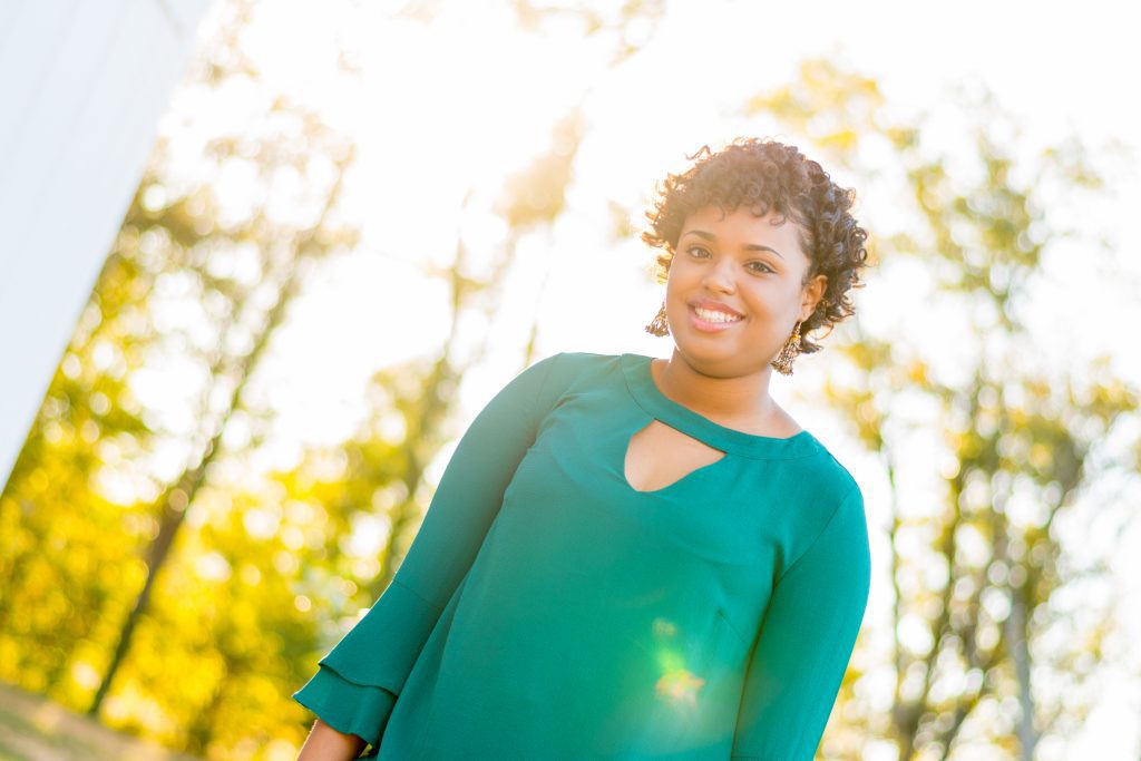
A few months ago I had the opportunity to do a photo shoot for La Petite Boutique. La Petite is a start-up boutique here in Jackson and we believe they are going to be around for a long time. We love taking photos for places that have customers who like them enough to be in the photos! 

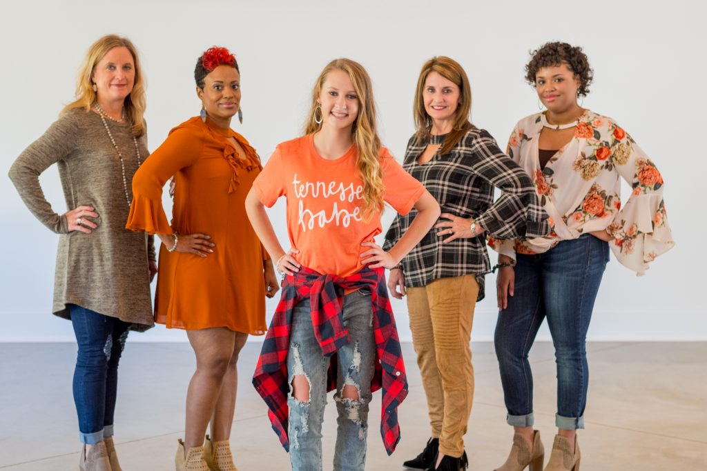
This shoot took place at the at White Oak Farms, which provided a great location to work with these ladies. Tabitha, the owner, came prepared with multiple outfits for each model. The number of models and outfits allowed us to constantly be shooting as others were getting ready as the shots were being taken.

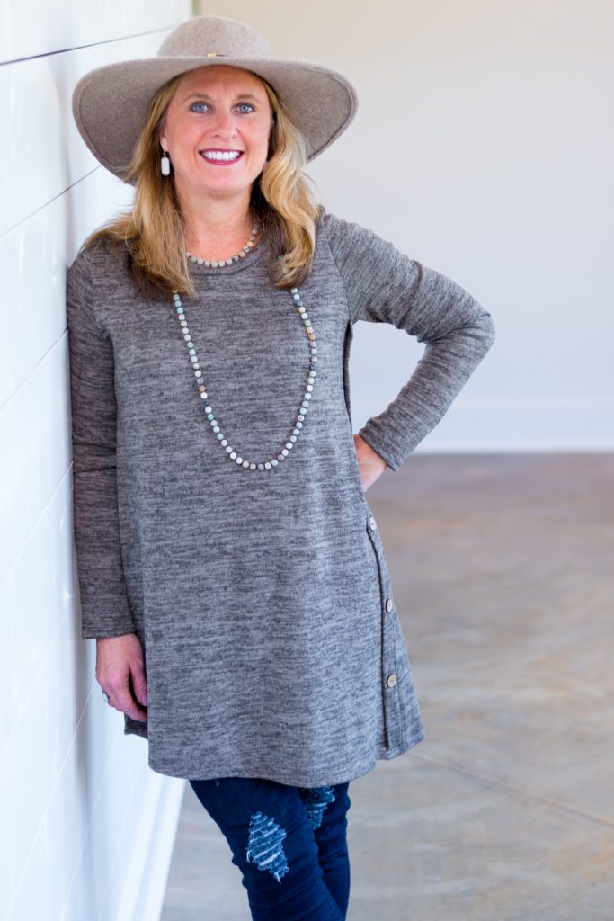
The natural light did us some favors. The White Oak Farms has some great windows and the grass was still green then! Golden hour is the best. Tabitha had these photos to use on social and in her print ads at the end of the year as she was ramping up for holiday sales! 


Introducing Ricky Santos!

At the beginning of the year, we welcomed Ricky Santos onto the Adelsberger Marketing team! Ricky had been working as one of the interns at theCo and his graphic design skills in particular caught our attention. 

Ricky was born in Divinópolis, Brazil and spent his four years of life there. In 2000, he and his family moved to Jackson. His father opened a painting company and Ricky helped every summer. But Ricky felt like painting wasn’t his career goal.

In high school, Ricky thought he would pursue a career as an engineer because he wanted to do a lot of problem solving. But he soon realized that math was not well suited for him. So he began to search for another career option that involved both creative and practical problem solving.

He found both of these items in the graphic design world. Ricky said, “I’m excited to work with Adelsberger Marketing because it will give me a chance to work with so many businesses in the local community and help them grow their business.”

His favorite projects at work involve creating motion graphics like gifs and branding companies. In his free time, he enjoys playing video games, drawing and dabbling with 3D modeling on the computer, and watching Netflix with his wife. Over the next year, Ricky plans to continue to expand his skills and develop more of the soft skills that are required in the industry.

Ricky and his wife, Patricia, welcomed their first child, Roscoe, into the world in December. Ricky is a Senior at Union University studying Graphic Design. His family attends Poplar Heights. And, in the words of Ricky, “I own more gray clothes than any one person should.” We’re glad to have Ricky working with us.

Book Review: Crushing It – Gary Vee

“Let me define discipline: it’s backing up your ambitions with your actions.” -Gary Vaynerchuck, Crushing It

Gary Vee is back with a new book. Crushing It is a quick read that packs in the value. Gary covers his pillars of how people can create a digital presence and a future of making a living doing what they love. The book breaks down into two main sections.

The first section is the pillars. He walks through how each pillar can push you to build the platform that can potentially give you the audience to make a living by following your passion.

Gary also walks through each of the major platforms for how to create that content. One of the things I think is significant is that he casts a vision about how you could find success using each of the platforms. But one of the good things about Gary is that he does not make it sound like you would find success as a social media influencer in a few weeks or months; he points out that it takes years.

The second major element to this book is that he walks through actual success stories of folks who took the first book, Crush It, and used it to become successful. Gary showcases success stories of different sizes and different industries. Each of these gives us a picture of how hard these folks had to work to become successful.

If you have any interest in being successful in the digital world in our age, this is a book to pick up and read through.

Superbowl LII Ads Quick Take!

Superbowl Ads seemed to have a better year than last year on the success rate. “Success” in this context means drawing positive attention to a brand and especially getting view count after the game online.

My two favorite ads this year did a fantastic job of surprising and delighting the audience.

    1. NFL. The NFL is running ads to try and get people excited about its sport that has been slipping in the ratings some recently. What started off as an innocuous practice scene from the Giants very quickly turned into a jaw-dropping, I can’t believe this is happening, moment. They capture the star power of Odell and Manning really quickly and kept people in longer by introducing the music 10 seconds in. The music sets off such an odd tone for a football commercial, it did a great job of keeping peoples’ attention. The dirty dancing tribute is the kind of thing that will live a long long life in the minds of fans!
    2. Doritos. While they also upset a bunch of folks by suggesting “a Lady Dorito” that didn’t crunch as loud, they did rock the Superbowl with a great use of celebrities. So funny, in fact, a friend made me watch it at dinner last night (I missed it during the game). This ad gets going a little faster than the NFL one and that gives it a social media advantage. Peter Dinklage is going to catch peoples’ attention very quickly and the first kicks in at 4 seconds which is going to help keep peoples’ attention. Great use of pop culture icons and geniously made to break into two separate 30-second spots to get even more mileage out of them!

And one loser.

Dodge.

Dodge decided to hijack the words of Martin Luther King to apply to a truck commercial. Seems in bad taste. To save the idea, they could have taken trucks out of it and just put a small dodge label at the end. The motivational talk by Dr. King is great, some of the visuals are great, but the very clear insertion of the trucks repeatedly was enough to cheapen it. Then to top it off, they decided to irritate every Vikings fan in existence with this one:


The Importance of Logo Design

What do we first think about when we look at a product or service? It’s not the company’s mission statement or net worth. It’s their logo.

A company’s logo is often their most valuable asset. It can move from the storefront to the envelopes; from the website to pens and pencils. That symbol should be able to convey who a company is quickly and precisely.

What makes a logo successful? I think these three general guidelines are great starting points for any company looking to rebrand or start-ups starting to thinking about their logo:

Brand Recognition: Why do we spend money on items that have company logos plastered on them like Nike hoodies or a a Coach handbag? It’s because we have a personal relationship or experience with the company that makes us want to be a part of it. Both Nike and Coach have done a phenomenal job making their logo such an iconic symbol of their brand. In part, that’s because they have a logo that is unique and makes sense to the brand. Logos that are just shapes or letters thrown together don’t have that same type of impact.

Timeless Design: In the same sense, logos that are designed with the latest trend in mind tend to need to redesigned in a couple of years when that trend falls out of favor. There’s nothing inherently wrong with redesigning logos, but the justification to do so must be more than just changing with the times. In 2010, GAP decided that they needed to update their logo and tried to do so by just changing the font to a more blocky sans serif and adding a random little blue square behind. The outcry and rage from their customers made GAP quickly revert back to their former logo which their customers loved.

Thought-out Design: During the time of the GAP fiasco, Netflix was in the middle of redesigning their brand as well. What they did that made that redesign successful was that they did their research and self-evaluation to guide the design strategy along. In the end, their new logo design had the same influences as the GAP logo did. But Netflix’s stayed true to what the company was about. So if your company is looking for a new logo, don’t look at what everyone else has already. Don’t be afraid to go for a logo that fits your own unique style and personality.

These three points won’t give you all the answers to what you’re logo should look like. But I think that they will help you find a logo that is true to what your company is about. And genuine honesty will also be what the customer sees and makes as part of their life.