2019 Digital Design Trends

The trends for 2019 in digital design are bright, bold, and fun! These trends are helping big companies and small businesses alike. Here are some of the most relevant trends that you can utilize for your business.

BOLDER and More Colors:

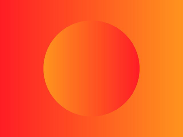
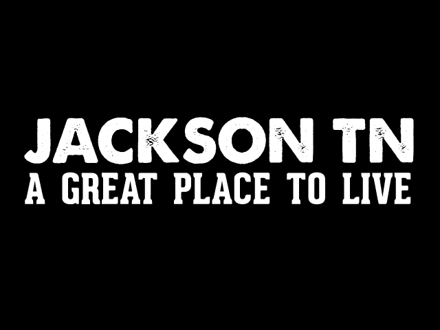
The purpose of digital design is to send a message to the viewers. In an age where there is information thrown from every angle, there has to be a way to break through all of the other messages. That is where big and bold design excels. This trend is seen in both typography and in the use of colors. Here are two examples.

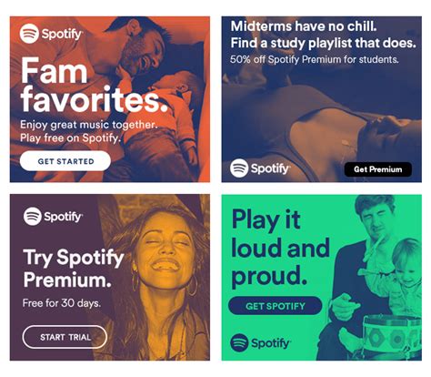
Branded Illustration & Gifs

Gifs have made a huge impact in the world – but so much so that their impact have lost its strength. A way that makes a gif impactful is by using gifs that are made specifically for your brand. These don’t have to be full production quality but instead can even be gifs made with apps like Boomerang for Instagram.
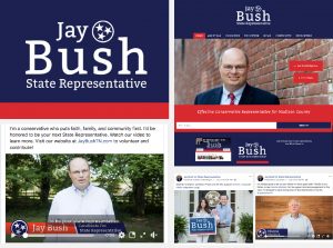
Branded Photos

Same as Gifs, the availability of stock photo markets have flooded our pages with generic photos. One way to break through all of those photos is to have photos taken for your brand that are well thought out. Just like gifs, photos are a way to show your audience who your brand is and what it is about.

Spotify Images

Is This the Best Example of Branded Content?

Jack Ryan

Not a clickbait title. I think this might really be the best example of sponsored content I have seen. Amazon Prime Partnered with Vice News to do a series of videos promoting the new Jack Ryan series. My favorite of the series is entitled: Cheated Death with a Former CIA Operative – Inspired by Tom Clancy’s Jack Ryan.

In this video, Vice News does it what it does best- tells stories in a real and gritty way through the video. They tell the life story of a former CIA Operative, Nic McKinley. I imagine their target audience for this campaign is men who like action, military, and adventure movies. So hearing from a CIA operative is a great way to catch their attention.

This video has a lot going for it:
1. Great production value. It has good quality and a variety of shots to help keep the viewer engaged.
2. It’s not overwhelming in its promotion of Jack Ryan. A few brief mentions but is very much about Nic McKinley.
3. Thrilling Stories. Nic does a great job sharing exciting stories from his career.
4. Behind the Scenes: Nic talks about his life as CIA and the bad side of his life as a CIA Operative.
4. The pivot. Near the end of the video, VICE News turns the story to talk about Nic’s current life in which he is fighting human trafficking.

The pivot at the end is what sealed the deal for me. Amazon allowed VICE to create a promotional piece that stayed true to who they were AND help promote a great mission that Nic is running in his post-CIA life. You can watch the piece below, let me know what you think about the brand integration:


Election Season 2018

We had the pleasure of working with four different campaigns this election season. Each campaign showcased a different personality and, as a result, each had different needs for their work. We are very selective of the groups we work with in this arena and I (Kevin) was glad to work with these four people not only as clients but also as friends.

  1. Jay Bush for State Representative.
    We did a lot of work for Jay Bush. We launched a website, created a campaign video, recorded testimonials with the community, took photos of families supporting Jay, and ran social media ads.
  2. Shannon Stewart for School Board:
    The “Shannon for Schools” branding needed to match the bright personality of the candidate. We went with an untraditional angle for the signage and branding. We also took some family photos to use during the campaign.
  3. Shawn Daly for School Board:
    Shawn is a fantastic candidate for school board. We created a traditional brand and landing page to help him introduce himself more to the community.
  4. AJ Massey for School Board:
    AJ’s branding colors are modeled after his favorite school, Ole Miss, and have an athletic flair (I mean the guy did play college football!). AJ ended up not having an opponent in the election so we didn’t have much additional work for him.

Client Spotlight: Don Polley and Associates

I recently finished a project for a startup Don Polley and Associates. The elements of the project were:

Branding, Website, Print Materials, Headshots, Videography, And a book!

I really enjoyed this project because I was able to use the width of my skillset to deliver for this client!

Don Polley was starting a business that needed to communicate professionalism to Human Resource managers and their leadership across industries. We started off with a brand that would help convey that Don was there to build bridges across the generational divide.


We followed that up with printed material to help distribute to a potentially older demographic and something he could leave with potential customers. See the flyer (front and back) and the business card (front and back).

Don needed some professional photography to help make sure he looked professional to his potential clients.

We also wanted to make sure the brand was up to snuff with the digital age because Don works with Millenials. We created a responsive website that featured a blog where Don can demonstrate his knowledge.

Don also saw video as an important part of marketing in 2017. So we created a short video of him explaining what the business was all about:

We also published an autobiography of Don’s and got it placed on Amazon. 

This was a great project and Don was an exceptional client. I have worked with few clients that defer to expertise as quickly and graciously. If you need help building a relationship with Millenials in your workplace, Don is the guy to talk to!

Client Spotlight: Wright Law

This month I draw attention to Pam Wright and her specialty law practice, Wright Law. Pam recently struck out on her own  after a long career in law with a nonprofit firm. After meeting with Pam I knew that I would be able to help becuase it was clear that she knew what she was talking about and interested in using the latest tech to do so. It’s important to remember that marketing can not help a stone roll uphill but it can help a stone roll downhill twice as fast.

Pam is the only Certified Elder law attorney in our area. She is an expert in helping families transition as members become elderly and need more care. If it has to do with ageing or special needs law, she is the person to call.

Marketing for attorneys is always a little tricky becuase: 1. They often need to be formal, 2. There are a lot of rules restricting their marketing and 3. They are extremely busy folks.

This project had a few major components. First, design a brand that would represent the firm to the community. This simple logo will work in all applications and be clearly communicate the name of the firm to the community:


WL-Blue-01


We also took headshots of Pam:

pwright-01-5

We created brochures to leave at targeted institutions in town:

Front of the Brochure

Back of the Brochure

But the crux of the project was the website. One of the interesting parts of the project was creating the glossary of terms to help educate Pam’s customers. Here is a link to the website.

Screen Shot 2016-06-28 at 8.26.33 AM-w1200-h1200


Client Spotlight: From Fluff to Fit

One of the things I love about working at theCO is the relationships that you make with other entrepreneurs. Bria Pittman is a member at theCO and the Fitness Coach/Owner at From Fluff to Fit.

Bria is on a mission to help people become healthy with the motto “progress not perfection.” While we met and talked about her business, I saw this motto as a truth that she embraced not only with her own life but also with her clients.  Being healthy is not about being super skinny, it’s about being active, taking care of oneself, and making good health choices more often than bad ones. I knew that the motto needed to be included in the logo.

When we got started Bria had one direction: Use this certain blue. So I went to work.

There were a bunch of versions of this logo but after many…many hours and attempts, I came back with a logo that Bria loved and we felt would communicate her brand to her target market as well.

This is the From Fluff to Fit logo by Adelsberger Marketing: frommflufftofit2-01

If you want to talk about getting a great brand for your company, send me an email.


Customer Spot Light: Turner Pet Cremation

When someone told me that Turner Pet Cremation was looking for help, I thought that was a some sort of joke. Not being a pet person, I had not ever looked into a service like this before. I came to find that Turner Pet Cremation is the best in the area at providing a dignified cremation process for someone’s pet.

During this process I got to know the Mitchell family who now run Turner Pet Cremation. They are real salt-of-the-earth people who were a pleasure to work with. Clayton, whose grandfather started the business, took me for a tour of their facility and showed me some of their most popular urns. One of the things I love about working with small businesses is all the things I get to learn from my customers about their businesses!

For Turner we created a new logo and a new website. (Check out the website here.)

Here is the logo:


Turner Pet Cremation Logo


I am currently accepting new clients, if you know of any businesses who need help with their marketing, please share this site with them.