2019 Digital Design Trends

The trends for 2019 in digital design are bright, bold, and fun! These trends are helping big companies and small businesses alike. Here are some of the most relevant trends that you can utilize for your business.

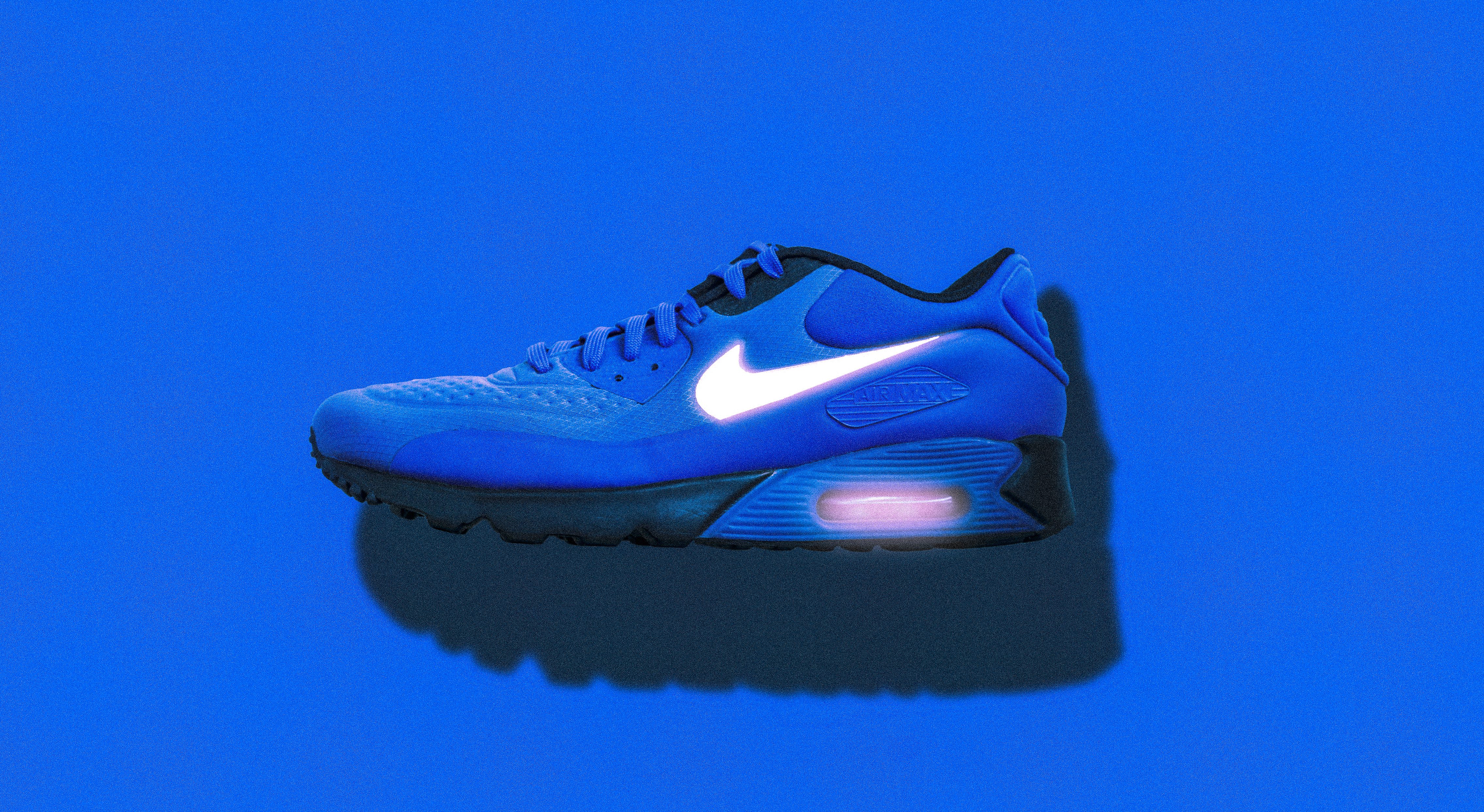
BOLDER and More Colors:

The purpose of digital design is to send a message to the viewers. In an age where there is information thrown from every angle, there has to be a way to break through all of the other messages. That is where big and bold design excels. This trend is seen in both typography and in the use of colors. Here are two examples.

Branded Illustration & Gifs

Gifs have made a huge impact in the world – but so much so that their impact have lost its strength. A way that makes a gif impactful is by using gifs that are made specifically for your brand. These don’t have to be full production quality but instead can even be gifs made with apps like Boomerang for Instagram.

Branded Photos

Same as Gifs, the availability of stock photo markets have flooded our pages with generic photos. One way to break through all of those photos is to have photos taken for your brand that are well thought out. Just like gifs, photos are a way to show your audience who your brand is and what it is about.
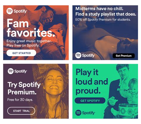
Spotify Images

Election Season 2018

We had the pleasure of working with four different campaigns this election season. Each campaign showcased a different personality and, as a result, each had different needs for their work. We are very selective of the groups we work with in this arena and I (Kevin) was glad to work with these four people not only as clients but also as friends.

  1. Jay Bush for State Representative.
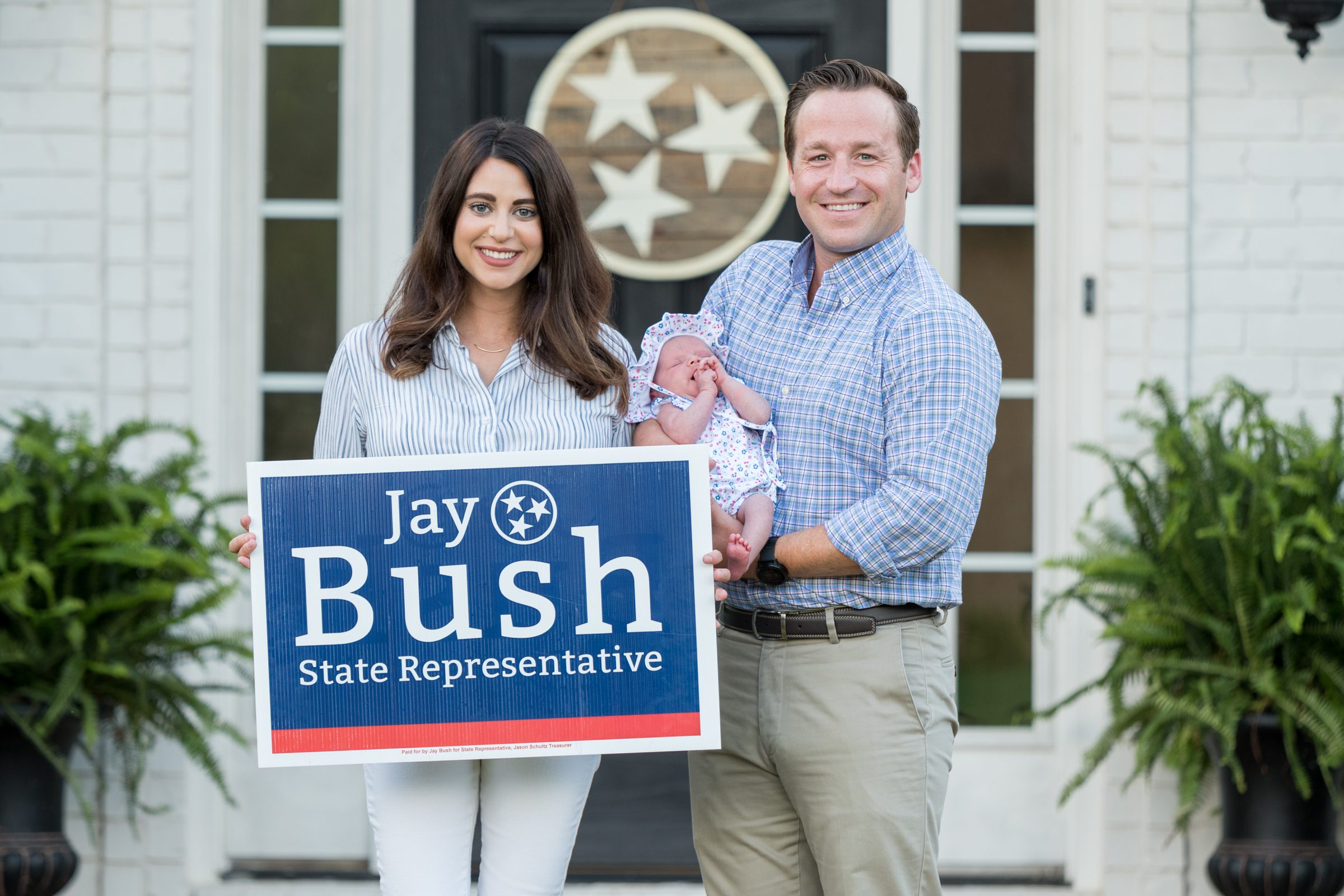
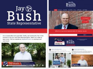
    We did a lot of work for Jay Bush. We launched a website, created a campaign video, recorded testimonials with the community, took photos of families supporting Jay, and ran social media ads.
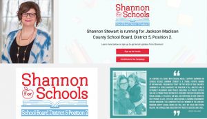
  2. Shannon Stewart for School Board:
    The “Shannon for Schools” branding needed to match the bright personality of the candidate. We went with an untraditional angle for the signage and branding. We also took some family photos to use during the campaign.
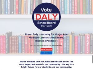
  3. Shawn Daly for School Board:
    Shawn is a fantastic candidate for school board. We created a traditional brand and landing page to help him introduce himself more to the community.
  4. AJ Massey for School Board:
    AJ’s branding colors are modeled after his favorite school, Ole Miss, and have an athletic flair (I mean the guy did play college football!). AJ ended up not having an opponent in the election so we didn’t have much additional work for him.

How Motion Improves Customer Experience

We have become accustomed to receiving mass amounts of information from various outlets throughout our day. To not get overwhelmed, we have also developed a subconscious system to filter out things that we know don’t interest us. Because of this, businesses have to figure out a way to connect with their customers in a non-intrusive way. One of these ways is the use of motion in your website, app, or social media post. In 2016, over 70% of all of the traffic online was video. That means that the greatest chance to reach a customer is to use a platform that they are primarily using. By using motion graphics in these videos, you will be able to hold their attention even longer.

This is because motion provides elements that a static graphic or photograph just can’t. For instance, take a look at this GIF that we made for one of our clients.

Now look a still from the gif.


With just stopping the motion, the personality of the graphic was taken away and made less interesting. We just naturally pay more attention to things that are moving especially when vibrant colors are involved.

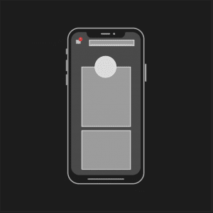
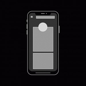
Another benefit with using motion is that it can be used to focus a viewer’s eyes to a specific spot on their screen. With the majority of people consuming content on their mobile devices, apps and mobile sites benefit greatly from having motion elements. Take a look at this mockup of an iPhone screen.


Bright colors can draw your viewer’s attention. But look at how much more engaging the same notification is when it moves:


When providing content to your customers, you want them to be focused on what your business has to offer. One way to do that is by attracting them with a little bit of motion. This can be in the form of a video background on a website or a non-intrusive alert that provides helpful information. While this is a somewhat new idea in the world of marketing, it has its origins in the world of video production. Interviews usually have name plates that are on the lower area of the screen to provide the viewer with some important information that could have been easily overlooked. This also serves as place for things that weren’t said in the video to be placed.

The same concept can be used with a call to action button on a website or on an animated social media post. Just remember that it is better to be simple and subtle rather than having something that is visually overbearing.

The Importance of Logo Design

What do we first think about when we look at a product or service? It’s not the company’s mission statement or net worth. It’s their logo.

A company’s logo is often their most valuable asset. It can move from the storefront to the envelopes; from the website to pens and pencils. That symbol should be able to convey who a company is quickly and precisely.

What makes a logo successful? I think these three general guidelines are great starting points for any company looking to rebrand or start-ups starting to thinking about their logo:

Brand Recognition: Why do we spend money on items that have company logos plastered on them like Nike hoodies or a a Coach handbag? It’s because we have a personal relationship or experience with the company that makes us want to be a part of it. Both Nike and Coach have done a phenomenal job making their logo such an iconic symbol of their brand. In part, that’s because they have a logo that is unique and makes sense to the brand. Logos that are just shapes or letters thrown together don’t have that same type of impact.

Timeless Design: In the same sense, logos that are designed with the latest trend in mind tend to need to redesigned in a couple of years when that trend falls out of favor. There’s nothing inherently wrong with redesigning logos, but the justification to do so must be more than just changing with the times. In 2010, GAP decided that they needed to update their logo and tried to do so by just changing the font to a more blocky sans serif and adding a random little blue square behind. The outcry and rage from their customers made GAP quickly revert back to their former logo which their customers loved.

Thought-out Design: During the time of the GAP fiasco, Netflix was in the middle of redesigning their brand as well. What they did that made that redesign successful was that they did their research and self-evaluation to guide the design strategy along. In the end, their new logo design had the same influences as the GAP logo did. But Netflix’s stayed true to what the company was about. So if your company is looking for a new logo, don’t look at what everyone else has already. Don’t be afraid to go for a logo that fits your own unique style and personality.

These three points won’t give you all the answers to what you’re logo should look like. But I think that they will help you find a logo that is true to what your company is about. And genuine honesty will also be what the customer sees and makes as part of their life.