Facebook’s 20% Rule

Facebook Grid Hate

Facebook’s 20% ad rule is terrible!

Facebook Grid Hate

I know this is nothing new but I have seemingly only recently starting running into this problem. The first time it struck: One of my clients has trivia on Saturday nights at his restaurant. I wanted to promote the trivia night and the logo for the trivia company was almost all text! I couldn’t promote an image with their logo prominently displayed because will it was more than 20%. It was extremely frustrating.

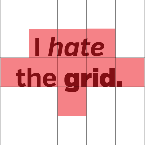
The most annoying part is the grid itself. If Facebook had a true 20% rule determined by text actually taking 20% of the screen, that would be more reasonable. You can work with that.

However if your text crosses into more than 5 squares your image will be rejected regardless of how little text their maybe. For example, some text that takes up 5% of the screen my touch 5 grids and therefore be rejected. (Of course this is assuming that you don’t squeak by somehow, which I have in the past).

In an attempt to preserve the visual aesthetic of Facebook they are in fact making marketers create less attractive images to meet their ridiculous grid system. So for marketers, I have created this Facebook sized image grid for standard timeline images. Just overlay this over the graphic you are designing and make sure that it doesn’t cross over the more than five grids.

I know this is a super low key solution but I am already using it to save time when trying to get an ad approved on Facebook.

Good luck!
Facebook Grid OVerlay

A Lesson from a sidewalk

This week I had an appointment on my alma mater’s campus. It was nice to walk around a place that was so meaningful to my development as a person. While walking across campus I noticed a corner where students walked from sidewalk to sidewalk without taking the path that was originally desired by the planners. This brought to mind two lessons we should take into mind when planning something for customers, attendees, users, etc:

IMG_1295

1.  Plan for customers. This design was an addition to the campus. The way it is designed is almost as if the designers failed to take into account the current structures in place. They also failed to anticipate that humans, not just college students, usually take the path of least resistance. Of course students wouldn’t walk the extra 18ft to merge with the current sidewalk! Take time to study what your customers might do, try to get into their shoes. In the tech world they build customer personas to try and learn this behavior.
2.  Plan to change. There is no way that you will be able to anticipate all the way your users will (mis)use your product. Humans are too unpredictable for that. But be prepared to make changes to better fit the user. This path has been trod for at least 5 years now. Instead of a new sidewalk being poured and fixing the problem an eye sore has developed in the heart of campus. Observe how customers use your product and make changes accordingly to make the experience great!


Arby’s Twitter Parody

Arby’s is getting some interest twitter traffic recently. While reading one of my favorite blogs last weekend, Another Week Ends by Mockingbird , I followed a link to what they described as a hilarious twitter account called: @nihilist_arbys. Now for the uninformed nihilism is defined: the rejection of all religious and moral principles, often in the belief that life is meaningless.

To combine Arby’s (the brand that use to use the tag “Its Good Mood Food”) and Nihilism is hilarious to me and apparently to the internet. At the time of writing, Nihilist Arby’s has close to 60,000 followers. This is an example of one of the tweets from the account:

Disclaimer: Not all of the tweets are family friendly. But some of them are pretty funny. Most parody accounts have nothing to do with the company they are mocking and I think this is true of Nihilist Arby’s as well. What turned this into a marketing article is what happened not to long after I followed Nihilist Arby’s. Nihilist Arby's Obtimist Arby's Now @optimist_arbys is an account run by Arby’s Corporate offices. This account tweets things like:


I like how Arby’s is trying to handle this parody account. They are trying to manage the parody account with a parody account of the parody account that meets up with their branding.

They are also being proactive, they were following people who were following the parody account.

Good work Arby’s!