Even though the election is not until next fall, the presidential campaigns have kicked off. While this is super frustrating to many, including myself, one of the upsides is you get to see lots of important branding. In this series of posts I am going to be evaluating the top candidates logos. How do I determine the top candidates? I used this study by the Washington Post. This will be a three post series. The first post will be dedicated to the Democrat candidates and the next two will be dedicated to the Republican candidates (because there are currently so very many of them). (Read about the Democrats Logos Here and the first half of the Republicans here.)
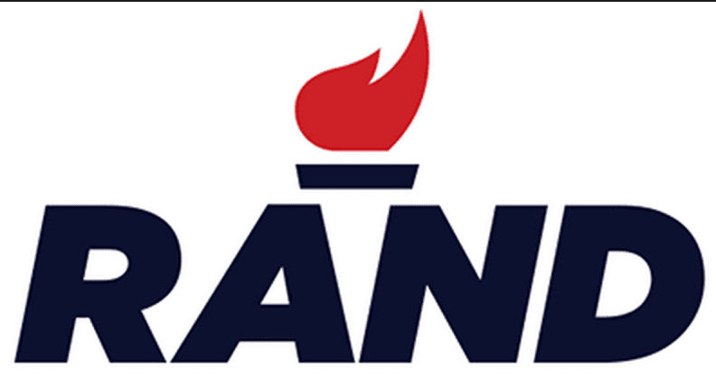
Rand Paul:
Visual appeal- 8
Symbolism- 8
Execution- 8
Total-24
Rand Paul is a man on fire. He wants change and with this aggressive logo, I think he communicates that clearly. It works well in different colors and it is my favorite. Simple but effective.

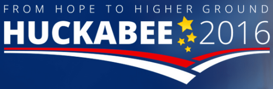
Mike Huckabee
Visual appeal- 6
Symbolism- 2
Execution- 5
Total-14
Nothing crazy going on here for Huckabee. If there is intentional symbolism here, I am completely missing it! Instead it looks like they selected some random abstract shapes and threw in a few stars. And the kerning between the K and A is way to close.
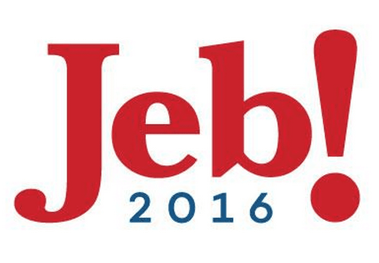
Jeb Bush
Visual appeal- 8
Symbolism- 4
Execution- 8
Total-20
Well someone is clearly trying to avoid associating himself with his brother. The natural move in a family such as this would be to invoke the fame. This is the most light hearted of the republican logos. I think the choice of an exclamation point is setting him up for a alternate logo with an upside down exclamation point trying to court the Spanish speaking vote. Also what an interesting b.
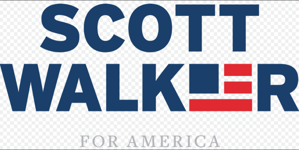
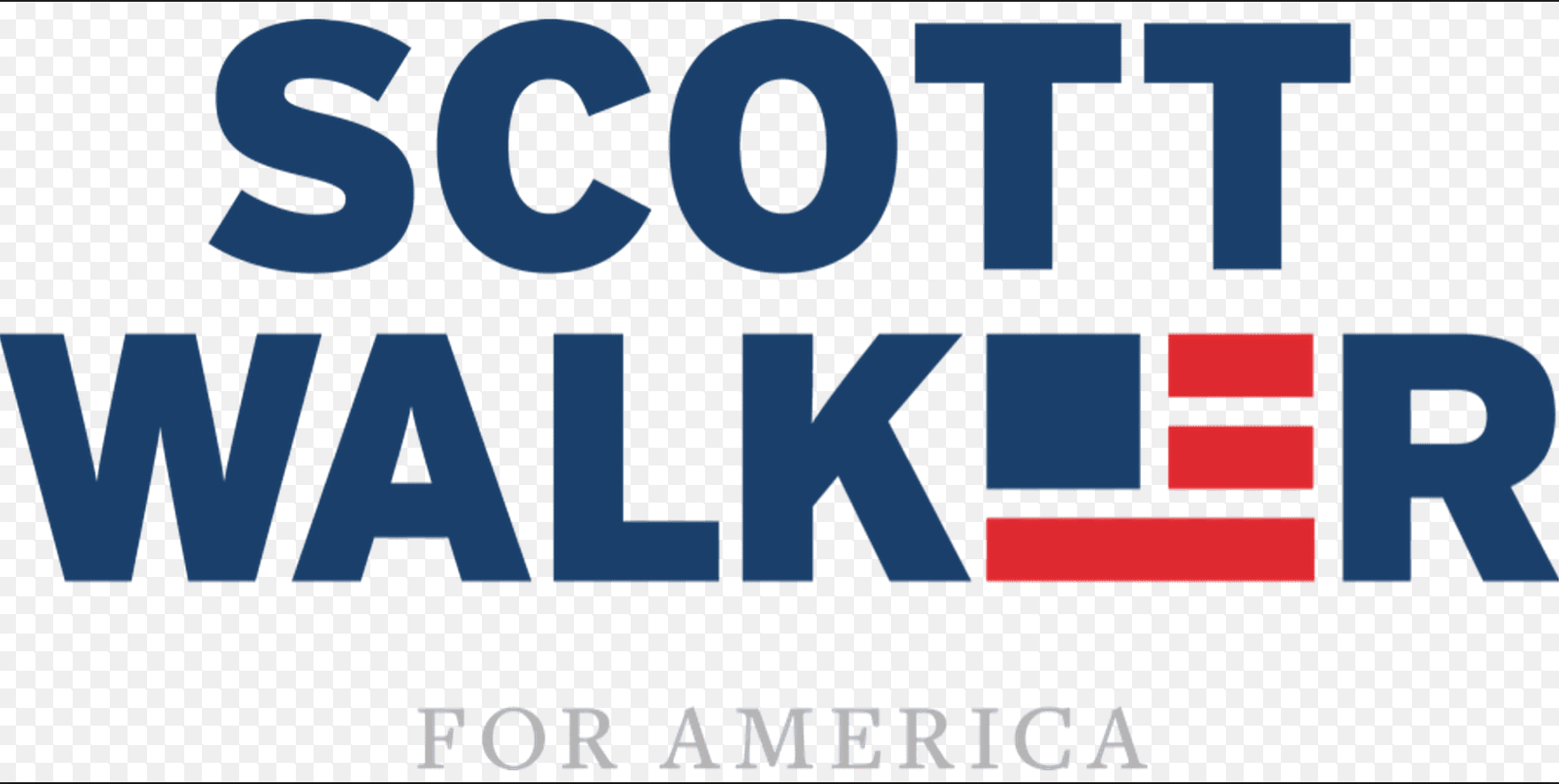
Scott Walker
Visual appeal- 8
Symbolism- 8
Execution- 8
Total-24
Probably the most creative inclusion of American Imagery this year. The block flag in place of the E strangely works for me. I think it would even be clear in one color. I feel like this candidate is a strong American loving candidate. Mission accomplished logo.
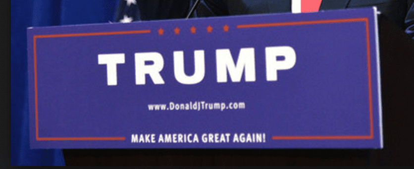
Donald Trump
Visual appeal- 4
Symbolism- 2
Execution- 4
Total-10
Trump doesn’t need a creative logo. Everyone knows who he is. I think that has more to do with his poll ratings then his true popularity. But this logo is exceptionally plain, thus the low rating.


