Skip to content
  • Home
  • Services
    • Marketing Strategy
      We love it when a plan comes together.
    • Branding & Identity
      "Whooooooo are you" - The Who
    • Videography
      Lights, Camera, Action
    • Fractional CMO
      Strategic Marketing Leadership
    • Websites
      Are you ready to be found?
    • Digital Advertising
      Let's talk to your target market.
    • Social Media
      Social for Sales, Recruitment, and Culture.
    • Podcasts
      Are you ready to be heard around the world?
    • Email Marketing
    • Graphic Design
    • Live Streaming
    • Motion Graphics
    • Photography
  • Resources

    The Content Machine Podcast

    More Episodes

    The Content Machine Podcast

    Attention and Action Book

    Digital Marketing Checklist

    Video Marketing Guidebook

  • Blog
  • About

    Meet the Team

    Become an Intern

  • Contact
Website Check Up Guide
Schedule a Meeting

Tag: logo

  1. Home
  2. Tag Archives: logo

Principles of Design

Design Elements

“Design” is more than a bunch of pictures and shapes thrown around until they eventually look right. There are some principles that are present in all good design. Here is an overview of six principles:

Unity\Harmony
Unity and Harmony exist when all the elements of the work flow together. When you look at a piece that is in harmony, there is a sense of completeness.

Balance
Balance is achieved when the weight of the elements are distributed equally through all of the work. 

Hierarchy
Hierarchy is used to show which elements are in conjunction. This will help the eyes move in the right direction so the viewer can understand the information more clearly.

Scale / Proportion
Scale and Proportion are used to relate the different elements to one another. The more in proportion the elements are to each other, the more unified that they feel.

Dominance/ Emphasis
Scale, Color, and Texture are just some of the ways that elements of a work can be featured.

Similarity and Contrast
Similarity and Contrast are another way to show off groups of elements or to emphasize just one.

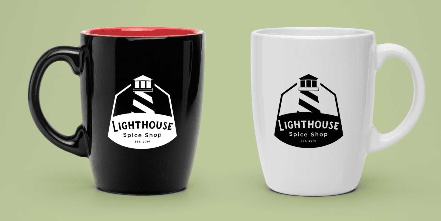
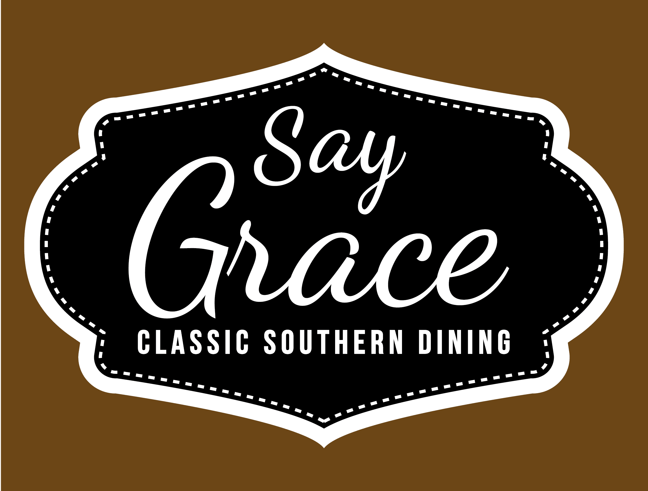
We like to consider these principles in all of our designs – whether it’s a logo rebrand or a brochure layout.

branding design Graphic Design logo

Candidate Logos Part 2: Republicans (Part 1)

Even though the election is not until next fall, the presidential campaigns have kicked off. While this is super frustrating to many, including myself, one of the upsides is you get to see lots of important branding. In this series of posts I am going to be evaluating the top candidates logos. How do I determine the top candidates? I used this study by the Washington Post.  This will be a three post series. The first post will be dedicated to the Democrat candidates and the next two will be dedicated to the Republican candidates (because there are currently so very many of them). (Read about the Democrats Logos Here and the second half of the republican logos here.)
Screen Shot 2015-07-21 at 4.53.23 PM
Chris Christie
Visual appeal- 8
Symbolism- 4
Execution- 6
Total-18
Notes: I am a fan of using a font with different weights in a logo(so much so that I used it in my logo). The tag line is good and pushes back against what most people feel about politicians in our society. But they take a hit in execution because just looking at it quickly I can tell that the spacing between ‘telling’ and ‘it’ is bigger than the spacing between the rest of the words in the  tag line.
Screen Shot 2015-07-21 at 4.52.21 PM
Ted Cruz
Visual appeal: 6
Symbolism: 6
Execution: 3
Total: 15Notes: Apparently a trend this year is logos is to squish the first and last name together, much like Marco Rubio and Ben Carson. The thing that confuses me on this logo is tear drop/oil drop/fire symbol on the side. It is confusing and while gives it a lot of symbolism, the symbolism makes no sense.

Screen Shot 2015-07-21 at 4.52.01 PMBen Carson


Visual appeal-4
Symbolism- 4
Execution- 2
Total: 10Notes: There are a lot of colors going on here. A lot of colors. The flag symbolism is interesting but weird with the three stars and two stripes. This might be the worst of the campaigns.

Screen Shot 2015-07-21 at 4.52.58 PM

Rick Perry:

Visual appeal- 6
Symbolism- 6
Execution-4
Total- 16Notes: Rick Perry if nothing else brings something very different to the table. I cant help but think about Popeyes when I see this though, but maybe Rick is a big fan of fried chicken. The star might be a reference to the lone star state that Rick was governor of so I can give him credit for that inclusion. There are a lot of colors around the star and it will be interesting seeing it in fewer colors. Also one of my pet peeves for political logos: When a logo or campaign sign states the office the candidate is running for without stating the word ‘for’. Perry is not the president, he is running ‘for’ president.
Screen Shot 2015-07-21 at 4.50.45 PM
Marco Rubio
Visual appeal- 7
Symbolism-5
Execution-5
Total- 17
Notes: I am not sure the reason for all lower case on his name but it does stand out against the other candidates logos. Also the use of America as the dot to his I will not translate to low quality prints or small prints.


logo

New Logo for Lighthouse Spice Shop

Lighthouse Spice Shop

The Lighthouse Spice Shop is in Milan, Tennessee and shares a block with some of my other clients. I was contacted about making a new logo for this business. When I got the call I immediatly was thinking, “Well the Lighthouse name gives some great imagery”. Turns out I had a hard time drawing up the lighthouse. But after studying several different lighthouses, a few designs came out.LHS Black Logo-01

Out of the designs submitted the business selected this badge style logo which will look great on most every application. One application that could be amazing is a special die cut label for their products. This was a fun project and I look forward to seeing it in use.

Check out the Lighthouse Spice Shop on facebook or their website here and be sure to try some of their amazing spices and teas!


Lighthouse Spice Shop

Graphic Design logo milan

Canidate Logos Part 1: Democrats

Even though the election is not until next fall, the presidential campaigns have kicked off. While this is super frustrating to many, including myself, one of the upsides is you get to see lots of important branding. In this series of posts I am going to be evaluating the top candidates logos. How do I determine the top candidates? I used this study by the Washington Post.  This will be a three post series. The first post will be dedicated to the Democrat candidates and the next two will be dedicated to the Republican candidates (because there are currently so very many of them). (Read the Republican Reviews here and here.)


One of the interesting thing is that both of the Democrats are basing their campaign image off their first name.
Lets start with the top Democratic Candidate:

Hilary Clinton

Screen Shot 2015-07-21 at 4.47.35 PM Ratings:
Visual Appeal: 4
Symbolism: 8
Execution: 4
16 out of 30.
Commentary:
•This logo comes off as very harsh to me, lots of straight lines and strong colors. I think this was an intentional choice to offset the potential perception of a softer female candidate.
•I appreciate the the attempt at symbolism but the arrow does not come out well in the execution. I think in a one color version the whole thing is lost. For me a logo absolutely needs to work in one color.
•I would have given a slight amount of space to the head of the arrow and the upright of the H. Another design interpertation would have been to leave the arrow as it is but add a boundary around the edges of the arrow.  I think in a one color version the whole thing is lost.

Bernie Sanders

Screen Shot 2015-07-21 at 4.48.06 PM
Ratings:
Visual appeal 8
Symbolism 4
Execution 8
20 out of 30
•I find this logo extremely visually pleasing. The waves at the bottom give a softness that makes me think this guys is a nice guy. This may have been done intentionally to counter the Harshness of Hilary’s logo.
•The softness logo along with the choice to go with the name Bernie instead of Sanders makes me think of a Grandpa.
•I don’t see the symbolism here which is always necessarily but something I appreciate in a logo.


Stay tuned for evaluations of the other candidate logos in the coming weeks! What do you think about the logos? (Not the candidates)
bernie sanders candidate hilary clinton logo political review

Customer Spotlight: Jesus Church Jackson

I am honored to call Mychal Hunt a friend. When he told me that he was going to be launching a new church in Jackson, I immediately wanted to know how I could help. While Renae and I would not be joining his new church, I knew I could use my skill set to help him launch Jesus Church Jackson.

After meeting a few times with Mychal I went to work on a website and logo for his new church. We also shot some short videos. I love the work that Mychal is doing in the city and I think Jesus Church will be a great thing for the city. If you would like to help with donations or volunteering somehow you can email him here.  The Jesus Church will be launching on April 26. For more information, check them out on Facebook or their website. 

Check out the website here. 

Here is the most scandalous logo I have ever made. A few notes:

1. The red symbolizes blood because one of the basic tenants of Christianity is that Jesus was crucified. The style of the font is also a reference to the original Passover when the Israelites used blood on the lentils of their doors in Egypt. (Exodus 12:7)

2. The “J” can also double as a cross. It is more evident in the symbol.

3. We also attached a symbol to the package for use on things like buttons and stickers.


Be in prayer for the Jesus Church as they try to reach Jackson!

JC Full Color Logo-01 JC Symbol Red Black

jesus church logo website

Customer Spotlight: Say Grace

Say Grace Enterance

This week one of my latest clients opened in Jackson. Say Grace: Classic Southern Dining, is opening on September 24. Say Grace Full Color-01

Say Grace is bringing family style dining to Jackson. Today Renae and I were honored to attend the soft opening of Say Grace. Make sure you come hungry if you go for lunch or dinner. You will be served 3-4 salads, biscuits and corn bread, 3-4 sides and then 2-3 main courses, oh and save room for dessert. My wife described it as a buffet that comes to you. My favorites: fried chicken, biscuits, and corn pudding.

Besides being family style, the host will sit you with whoever else is coming in the restaurant while you are there. This is a great opportunity to meet other people in the community.

My work for Say Grace has been the logo and a website. Saygracejackson.com.  We went for a badge style logo that would look good on many different mediums. Also important was to emphasize the unique name of the restaurant. Because the name might not be intuitive to the uninitiated we included the tag line in the logo to make it easier to understand. We also wanted a classic look to match up with the classic style of the restaurant.

The website is a more modern one page theme. A one page was selected so that it will look great on mobile devices.

Make sure you check out Say Grace when the open on September 24!


Sign up for my monthly marketing email below:

[yks-mailchimp-list id=”1efe62ada3″ submit_text=”Sign up for Adelsberger Marketing’s monthly email. “]

branding case study logo

Recent Posts

  • Book Review: Day Trading Attention by Gary Vee | Content Machine Ep. 94
  • Book Review: Day Trading Attention by Gary Vee | Content Machine Ep. 94
  • The Splintering of TikTok | Content Machine Ep. 93
  • The Splintering of TikTok | Content Machine Ep. 93
  • 2024 Fall Interns | Content Machine Ep. 92

Recent Comments

  • Making Ideas Presistent | Adelsberger Marketing on Theme for 2021: Process
  • Facebook's Newsfeed Principles: Part 2 | Adelsberger Marketing on Facebook’s Newsfeed Principles: Part 1
  • Jonathan on State of the Apps: May 2018
  • Don Polley on A Follow Up: Best Self Journal
  • Creating Better Content in 2018 | Thompson Industries | Jackson TN on Blog

Archives

  • March 2025
  • February 2025
  • December 2024
  • November 2024
  • October 2024
  • September 2024
  • August 2024
  • July 2024
  • June 2024
  • May 2024
  • April 2024
  • March 2024
  • February 2024
  • January 2024
  • December 2023
  • November 2023
  • October 2023
  • September 2023
  • August 2023
  • July 2023
  • June 2023
  • May 2023
  • April 2023
  • March 2023
  • February 2023
  • January 2023
  • December 2022
  • November 2022
  • September 2022
  • December 2021
  • November 2021
  • October 2021
  • September 2021
  • August 2021
  • July 2021
  • June 2021
  • May 2021
  • April 2021
  • March 2021
  • February 2021
  • January 2021
  • December 2020
  • October 2020
  • September 2020
  • May 2020
  • December 2019
  • July 2019
  • June 2019
  • May 2019
  • April 2019
  • December 2018
  • November 2018
  • October 2018
  • September 2018
  • August 2018
  • May 2018
  • April 2018
  • March 2018
  • February 2018
  • January 2018
  • December 2017
  • November 2017
  • October 2017
  • September 2017
  • August 2017
  • June 2017
  • May 2017
  • April 2017
  • March 2017
  • February 2017
  • January 2017
  • December 2016
  • November 2016
  • October 2016
  • September 2016
  • August 2016
  • July 2016
  • June 2016
  • May 2016
  • April 2016
  • March 2016
  • February 2016
  • January 2016
  • December 2015
  • November 2015
  • October 2015
  • September 2015
  • August 2015
  • July 2015
  • May 2015
  • April 2015
  • March 2015
  • February 2015
  • January 2015
  • December 2014
  • November 2014
  • October 2014
  • September 2014
  • July 2014
  • May 2014

Categories

  • Attention and Action
  • Behind the Scenes
  • Blog
  • Branding and Logos
  • Chapter 1
  • Chapter 2
  • Chapter 3
  • Chapter 4
  • Chapter 5
  • Chapter 6
  • Chapter 7
  • Chapter 8
  • Chapter 9
  • Design
  • Digital Advertising
  • Internship Diary
  • Photography
  • Podcast
  • Productivity
  • Social and Email
  • Uncategorized
  • Videography
  • Website
  • Work

Meta

  • Log in
  • Entries feed
  • Comments feed
  • WordPress.org
AM Shield No Words-01
ATA_LOGO-Amplified-BTM-RGB

Site Map

Home

Services

Tools

Blog

About

Contact

Internships

Privacy Policy

Cookie Policy

Terms of Service

MEMBER OF:

Facebook-f Twitter Instagram Youtube Weibo Linkedin Tiktok
Copyright © 2025 | Adelsberger Marketing

Adelsberger Marketing
8 Yorkshire Cove, Jackson, TN 38305

Home

Services

Marketing Strategy

Branding & Identity

Videography

Fractional CMO

Websites

Digital Advertising

Social Media

Email Marketing

Graphic Design

Live Streaming

Motion Graphics

Photography

Podcasts

Resources

Blog

About Us

The Team

Become an Intern

Contact

90 Day Content Plan
Schedule a Meeting
That section isnt out yet! Sign Up Here To The Latest In Your Inbox!
Enter your email address

No thanks, I’m not interested!