One of my favorite parts of my job is helping people tell their stories. This year the United Way of West Tennessee‘s First Ladies Luncheon chose to focus on a story from an organization they support – The Scarlet Rope Project. Tiffany was kind enough to share with us her story of survival and the life-giving work of Scarlet Rope.
We also worked with the United Way to create a promo to help let men know they were invited to the First Ladies Luncheon. This was a fairly organic project. It evolved as we shot it with board members and the fantastic Becky Fly, who was a great sport about the whole thing!
F8 is Facebook’s mostly annual conference that often announces new features. The conference started as an 8-hour hackathon. It has developed throughout the years into a 2-day event for developers from around the world to network, attend in-depth mini-sessions, and enjoy product demos. This year’s F8 was held April 30-May 1st in San Jose, California. 2019 marked Facebook’s 10th F8.
A Recap of The Keynote
Privacy. Privacy. And more privacy. Not only that – but a bold statement that “The future is private.”
Mark Zuckerberg acknowledged they don’t have the strongest reputation on privacy right now. The only way you’ve missed this drama is if you’ve been left in the quantum realm. If that’s you – go ahead and read Wired’s article which recaps the past year and a half.
Zuckerberg continued by saying they are “building a privacy focused platform…privacy gives us the freedom to be ourselves.” He then made certain to mention that his team is going to play a more “proactive role” in making sure all services and partners are using their tools for good.
He continued his theme of “The Future is Private” by listing the next chapter for their services. This vision is based on 6 principles:
Private interactions
Encryption
Reduced permanence
Safety
Interoperability
Secure data storage
What This Means for Facebook & Messenger
Facebook
Zuckerberg has nicknamed this update “FB5.” And it’s more than an icon update (have you noticed the slight gradient to the blue?)
If the overall theme was “privacy,” I’d say that the Facebook theme was “connection.” The app will now downplay the News Feed as the central point of connection. Instead, Facebook is pushing Events and Groups to center stage.
Communities and Groups now replace Friends as the central focus. You can now share to your groups the same way you share with friends and family. The Newsfeed still exists – and a feature I particularly like – will allow you to save your spot so you can pick up where you left off.
Here’s where some serious changes start happening: relationships. Facebook is now in the business of actively connecting people – be it dating relationships, friendships, gaming communities, or even job searches.
With Facebook dating you find matches based on things you have in common like shared groups and events. Your dating profile is separate from your personal profile.
This is currently live in: Colombia, Mexico, Thailand, Argentina, Canada, Philippines, Vietnam, Singapore, Malaysia, Laos, Brazil, Peru, Chile, Bolivia, Ecuador, Paraguay, Uruguay, Guyana, Suriname
End of Year: US
Facebook is also introducing Secret Crush. In this section, you create a private list of friends you might be interested in. And if your friend also puts you on their list, you match. If not, no one will know you even opted into Facebook Dating.
They are also adding new Business Tools which are considered to be “plug-and-play solutions.” The goal is to make it easier for businesses to drive in-store traffic, generate leads, and provide customer care. Two of these new tools include an appointment-booking function and a lead generation template built directly into Ads Manager.
Messenger
One of the most exciting changes to Messenger is size and speed. It is going from 127 MB to under 30 MB with 1.3 second cold start time. Keeping with the privacy theme, the Messenger app will be end-to-end encrypted by default.
And we once again see the increased focus on connectivity. Messenger will allow you to call and message friends and family not just on Facebook but also Instagram and WhatsApp.
The goal is to make Messenger the place for your closest friends and family to keep in constant contact. You can even watch videos together directly inside the app.
They are also launching a brand new Messenger desktop app for both Windows and macOS.
How This Affects Your Marketing Strategies
If nothing else, hear this – Facebook believes they know what their 2.7 billion users want above all else – not necessarily shiny new objects, cheaper prices, or gimmicks!
They want to use their technology to gain meaningful human connection.
People don’t want to feel spammed by your ads. They want to feel connected to your product and brand.
Your customers want to feel certain that their information is secure. That your brand is trustworthy. And that you aren’t going to take advantage of them.
F8 2019 celebrated their global community and how technology can bring people together both personally and professionally.
The trends for 2019 in digital design are bright, bold, and fun! These trends are helping big companies and small businesses alike. Here are some of the most relevant trends that you can utilize for your business.
BOLDER and More Colors:
The purpose of digital design is to send a message to the viewers. In an age where there is information thrown from every angle, there has to be a way to break through all of the other messages. That is where big and bold design excels. This trend is seen in both typography and in the use of colors. Here are two examples.
Branded Illustration & Gifs
Gifs have made a huge impact in the world – but so much so that their impact have lost its strength. A way that makes a gif impactful is by using gifs that are made specifically for your brand. These don’t have to be full production quality but instead can even be gifs made with apps like Boomerang for Instagram.
Branded Photos
Same as Gifs, the availability of stock photo markets have flooded our pages with generic photos. One way to break through all of those photos is to have photos taken for your brand that are well thought out. Just like gifs, photos are a way to show your audience who your brand is and what it is about.
Have you ever bitten off more than you can chew? When the first few pitches for the 2019 Jackson Chamber Annual Celebration video were left on the cutting room floor, one day remained. Being the genius I am, I suggested that we put the Chamber staff into old movies that revolved around the event’s nautical theme. Below I am going to do a breakdown of the process behind pulling this video off (this was a bit of a step up in difficulty over last year’s hit Carpool Karaoke).
1. Plan plan plan. We spent several hours planning out the video. This was key because we needed to find the right videos. It would not be as easy as selecting any scene from any nautical themed video, we needed certain scenes. What we discovered was that after a certain year of movies, the camera motion had gotten so loose, that it would be difficult to “green screen” people into movies. This limited our selection greatly and we were able to come up with just one scene more than was actually used in the project.
After we selected the scenes and received approval from the Jackson Chamber, we then went to work doing a scene breakdown. Each breakdown involved light placements, sound design, camera angles, costumes, props, dialogue, and scripting. Brittany Crockett on our team did a fantastic job of sourcing much of our costume work and props. She also worked with the Chamber staff on their dialogue.
2. Having the Right Equipment. To pull off this level of green screen project well, it took a lot of lighting and the appropriate green screens in addition to decent cameras and a space to work in. We even bought chroma green duct tape for the project!
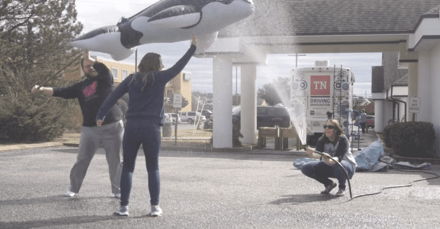
3. Details, details, details. On the shoot days, we needed to be sure we got as close as we could to match the movement of the character in the scene, the camera angle, and the lighting. Though we had covered much of this in preproduction, it is another thing to make it work with actors on set. The Jackson Chamber staff were great sports during the entire process and we all had a good time. Particularly humorous was the Free Willy jump scene where Brittany got to spray me and Hannah with a hose while I moved an inflated whale with a broomstick taped to its back over Hannah’s head.
4. Time and After Effects. After the filming was done, the remainder of the work fell to team member Ricky Santos who spent a large amount of time in After Effects keying, scaling, content-aware filling the Chamber staff into these old movies.
As Will Farrell as Harry Carry made us all aware: Hotdogs are items of deep mystery. If you were a hotdog, would you eat yourself? Is a hotdog a sandwich?
I want to tip my hat to Oscar-Mayer . Here’s a shoutout for a very clever marketing idea. On National Sandwich Day, Oscar-Mayer launched a (sadly) 24-hour hotline for people to call to talk about whether hotdogs were sandwiches or not.
We know what’s true… But we’re gonna give you 24 hours to change our mind. Call to tell us why you think a hot dog IS NOT a sandwich. #ChangeOscarsMindpic.twitter.com/mhUoHBmnre
People got a little heated and even other brands got involved. Jimmy Johns took up for sandwiches. In general it was a very fun promo, some folks had strong feelings about the issue:
How often does a brand stir controversy while keeping it family friendly and not a PR disaster? Almost never. They got people talking about their product and brand in a fun way and no harm was done. I think the part that made it really work was the inclusion of the “hotline.” A low cost but brilliant solution to help give people some fun way to engage!
Things get a little spooky at Medina this time of year at the farm in Medina. This community event is created by the Medina Lions Club and has been going on for 40 years. Since it is run by a civic group, all the scarers are volunteers and all the funds go to support local charities. We did a number of things for this project but the primary piece was the video.
Shooting a video at a farm and in the woods in the dark away from electricity was a bit of a challenge. Luckily, we have invested in the Sony A7SII line of cameras that are renowned for there excellent low light capability. We also brought several battery-powered lights with us for the shoot. The ‘hero’ image of Pennywise walking through the forest was achieved with a battery-powered 120D and two Dracast LED panels and a fog machine. (The most unnerving thing of the whole night was that Pennywise didn’t break character even when we were shooting this scene.)
The scarers were all super great about being filmed and did a great job of working with us. While the production was tricky, everything was taken to the next level in editing. Editing to music helped make the scary footage even more terrifying.
This video had amazing organic results! With over 100 shares and 15,000 views in the first couple of days, it spoke to a few things:
1. The Community is invested in this project. It takes lots of folks from lots of different groups of people to put this on, which connects the project with lots of different tribes around the area. It is also entering its 40th year so that leaves a legacy to connect to.
2. This is the first year they have promoted the farm in this way. There is a novelty to this video. People seemed to really enjoy that.
3. The production value of the video made people excited about the farm. If we had shot this on a cell phone, people would not have been as interested in the content. The high production value makes it worth watching!
Reese’s Cups, as we all know, are the greatest candy made! Their marketing team came up with a great idea this past Halloween. During a season where they probably sell some of their highest amounts of product, they were not inclined to sit on the sideline. They introduced the Reese’s Candy Converter.
The Reese’s Candy Converter was stationed in NYC and was loaded with 10,000 Reese’s Cups. Children (and probably several adults) were able to bring there “junk” candy to and exchange it for Reese’s Cups.
The free press generated on this is huge – with over 5K shares generated on their twitter account alone. This helped bring Reese’s to the mind of lots of people on the internet if they weren’t already thinking about getting Reese’s on Halloween.
They also positioned themselves as THE candy to have at Halloween. Usually, I feel like arrogant claims of superiority are bad for a brand, but when they come in such a fun way, it is hard to argue with!
The novelty of the idea and the expert execution of the concept made for a viral social media darling that is becoming more and more rare. My only question is, where did all of the traded-in candy go?
We’ve said it before – websites are no longer an optional part of a business. They give you the unique opportunity to present information to your customers and potential customers when they research and compare you to your competitors. Without stellar content, the time your potential customers spend on your website could be a waste.
Creating awesome website content is a process that starts with a good plan. Whether you are creating a new website or updating an existing website, you should complete an evaluation of your organization before digging in and composing your content. Each time we meet with a potential new client, and even when we recently updated our own website, we start with these five questions.
Recently, we worked with ASPELL Recovery Center here in West Tennessee and began with this same process to find out what information was crucial to include on their new website. We also have a number of other new websites in development, so keep an eye out for those launching in the coming months.
Do you know your organization?
What is your company’s history? To clearly communicate who you are to others, you need to know who you are. Spend time with your management teams and employees talking about your past, present, and future as an organization.
Do you have a Mission or Vision Statement? If you do have one, make sure these statements identify who you are as a company. If you do not have one, consider crafting one before launching or relaunching your site.
What makes your organization unique?
What do you do, that others don’t? Why would you be chosen over your competitors?
There is always something that makes us unique from others. It is essential to identify that in order to show your customers why your business is the better choice. Once you know this aspect of your company, you are ready to tell the world!
Who are your competitors?
Name your top competitors – those whom you compete directly with for business on a daily basis.
Competition drives us to be better. Knowing your competition helps you better determine your strengths and weaknesses. You are also better prepared to make your company stand out, instead of blending into what everyone else is doing.
Who are your customers?
Is it a busy, working mom? A retired couple? A College student?
By knowing who your customers are, you can clearly understand and communicate what you do to make their lives better. That message needs to be conveyed immediately. Don’t make your customers search for what you do!
What is the goal of the website?
What do you want your customer to do?
Make sure to develop a clear Call to Action (CTA). People need to know what you want them to do on your website. Do you want them to buy something? Do you want them to schedule an appointment? Make it clear and make the buttons easy to find and click.
Anyone can put up a website, but one with carefully planned out content that is relevant to your industry, up-to-date, and easy to navigate is a different story. Taking the time to do this will always have you a step ahead of the competition. By spending time on quality content, your website will be at the top of search pages without spending extra advertising dollars.
Ready to conquer a new website but need additional guidance? Make sure to download a copy of our Digital Marketing Checklist and then schedule a meeting with one of our experts here at Adelsberger Marketing. That’s what we are here for. Click below and we’ll get started.
Video projects are pretty varied. Sometimes you show up with a little idea of what you want to shoot and allow the location and subject matter to direct you. Sometimes, however, you have to plan every shot out ahead of time. This was one of those times. With Paige from the Jackson Convention and Visitors Bureau, we planned out every shot of this video. Part of the reason this was so important was the goal. We used motion tracking to display statistics in places all over the Jackson area.
This meant going to several locations and filming very specific shots. Then, we combined them with music to give them a unified feel. Using the motion tracking abilities of Adobe After Effects, we were able to insert the explanatory text and numbers into the different scenes. We also used ‘practical effects’ (noncomputer generated effects) and incorporated numbers that were already in use at locations when we could.
Three great examples of this:
1. At the Old Country Store, we used the practical effect of shaped mashed potatoes (Sculpted by JXNTNWKND Host Paige Keith) in combination with digital effects to leave words on the table.2. At ComeUnity Cafe, we used the practical effect of a hand-lettered (Hand lettered by Renae Adelsberger) number with a digitally placed explanation for clarity. This was done to match the style of the menu used by Comeunity Cafe.3. At Rusty’s TV and Movie Car Museum, we were able to use the existing number of the General Lee to illustrate a point with digital words next to it.
It was also fun using real music for a video! Most of the time, we use stock audio. That can be bland sometimes. LoLo, a local Jackson artist, allowed us to use her song “No Time for Lonely” for this video. Using that song added a great beat and excitement to the video!
Not a clickbait title. I think this might really be the best example of sponsored content I have seen. Amazon Prime Partnered with Vice News to do a series of videos promoting the new Jack Ryan series. My favorite of the series is entitled: Cheated Death with a Former CIA Operative – Inspired by Tom Clancy’s Jack Ryan.
In this video, Vice News does it what it does best- tells stories in a real and gritty way through the video. They tell the life story of a former CIA Operative, Nic McKinley. I imagine their target audience for this campaign is men who like action, military, and adventure movies. So hearing from a CIA operative is a great way to catch their attention.
This video has a lot going for it: 1. Great production value. It has good quality and a variety of shots to help keep the viewer engaged. 2. It’s not overwhelming in its promotion of Jack Ryan. A few brief mentions but is very much about Nic McKinley. 3. Thrilling Stories. Nic does a great job sharing exciting stories from his career. 4. Behind the Scenes: Nic talks about his life as CIA and the bad side of his life as a CIA Operative. 4. The pivot. Near the end of the video, VICE News turns the story to talk about Nic’s current life in which he is fighting human trafficking.
The pivot at the end is what sealed the deal for me. Amazon allowed VICE to create a promotional piece that stayed true to who they were AND help promote a great mission that Nic is running in his post-CIA life. You can watch the piece below, let me know what you think about the brand integration: