

Even though the election is not until next fall, the presidential campaigns have kicked off. While this is super frustrating to many, including myself, one of the upsides is you get to see lots of important branding. In this series of posts I am going to be evaluating the top candidates logos. How do I determine the top candidates? I used this study by the Washington Post. This will be a three post series. The first post will be dedicated to the Democrat candidates and the next two will be dedicated to the Republican candidates (because there are currently so very many of them). (Read about the Democrats Logos Here and the second half of the republican logos here.)
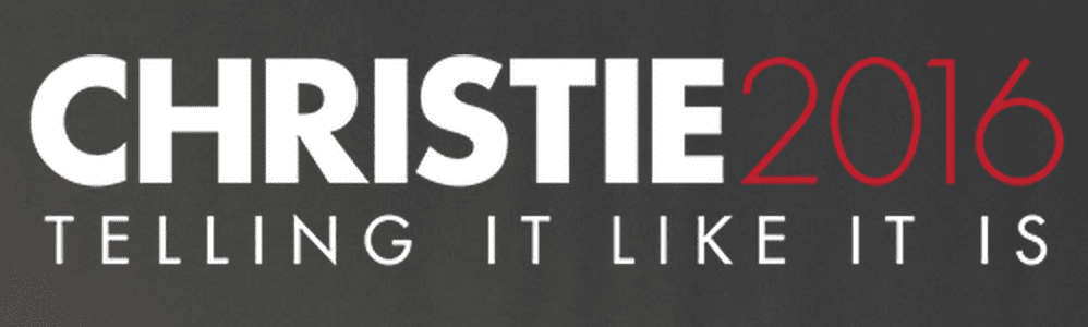
Chris Christie
Visual appeal- 8
Symbolism- 4
Execution-Â 6
Total-18
Notes: I am a fan of using a font with different weights in a logo(so much so that I used it in my logo). The tag line is good and pushes back against what most people feel about politicians in our society. But they take a hit in execution because just looking at it quickly I can tell that the spacing between ‘telling’ and ‘it’ is bigger than the spacing between the rest of the words in the  tag line.
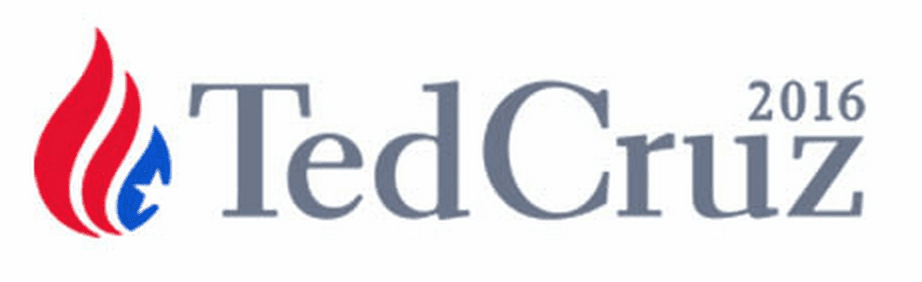
Ted Cruz
Visual appeal: 6
Symbolism: 6
Execution: 3
Total: 15Notes: Apparently a trend this year is logos is to squish the first and last name together, much like Marco Rubio and Ben Carson. The thing that confuses me on this logo is tear drop/oil drop/fire symbol on the side. It is confusing and while gives it a lot of symbolism, the symbolism makes no sense.
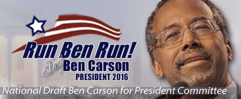
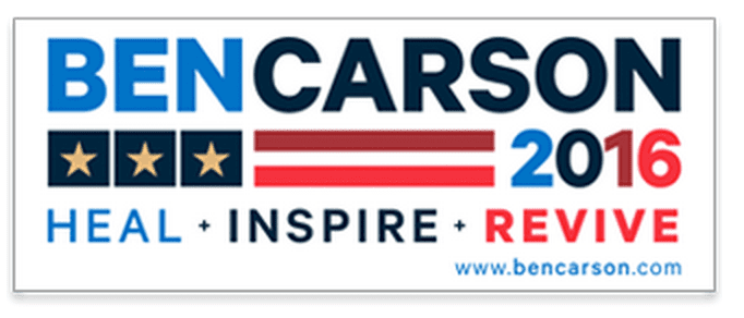 Ben Carson
Visual appeal-4
Symbolism-Â 4
Execution-Â 2
Total: 10Notes: There are a lot of colors going on here. A lot of colors. The flag symbolism is interesting but weird with the three stars and two stripes. This might be the worst of the campaigns.
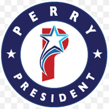
Rick Perry:

Visual appeal- 6
Symbolism-Â 6
Execution-4
Total- 16Notes: Rick Perry if nothing else brings something very different to the table. I cant help but think about Popeyes when I see this though, but maybe Rick is a big fan of fried chicken. The star might be a reference to the lone star state that Rick was governor of so I can give him credit for that inclusion. There are a lot of colors around the star and it will be interesting seeing it in fewer colors. Also one of my pet peeves for political logos: When a logo or campaign sign states the office the candidate is running for without stating the word ‘for’. Perry is not the president, he is running ‘for’ president.
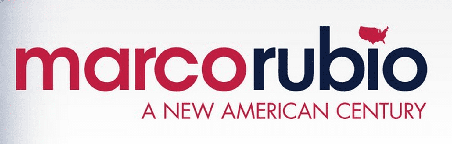
Marco Rubio
Visual appeal- 7
Symbolism-5
Execution-5
Total- 17
Notes: I am not sure the reason for all lower case on his name but it does stand out against the other candidates logos. Also the use of America as the dot to his I will not translate to low quality prints or small prints.


