How we got 7k organic reach…over night.

Great content is the king of the internet. But by defining it as great means that it is rare. Do not expect to make great content everyday but be ready to take advantage when you do.

Making great content is hard to do and it can be even more difficult depending on your industry. This video started with an amazing story and we put the time into make it a professional production to create a huge PR coup for a small non-profit. Madison County CASA is a charity that I support and I was recently hired through a grant to create a new website and video for them.

Lets take a look at a breakdown of the stats:

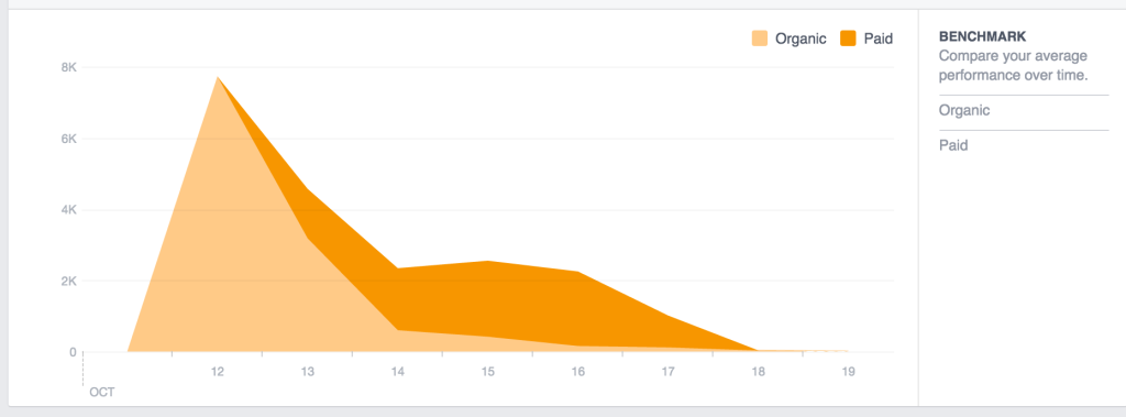
The video did really well initially on its own. The organic reach was great! People were sharing, liking, and commenting organically. The key was amazing content that gets people emotionally invested. Screen Shot 2015-10-19 at 11.03.26 AMIn the first 24 hours the organic reach went up to 7,721! What amazing reach for a Facebook page with only 647 fans(before the video was posted). When I felt like the organic reach was starting to come off its highest point, I activated a $25 boost to fans and friends of fans of the CASA page.  As you can see below, as the organic reach dropped I used the boost to help increase its reach to the community.

Screen Shot 2015-10-19 at 11.03.21 AM

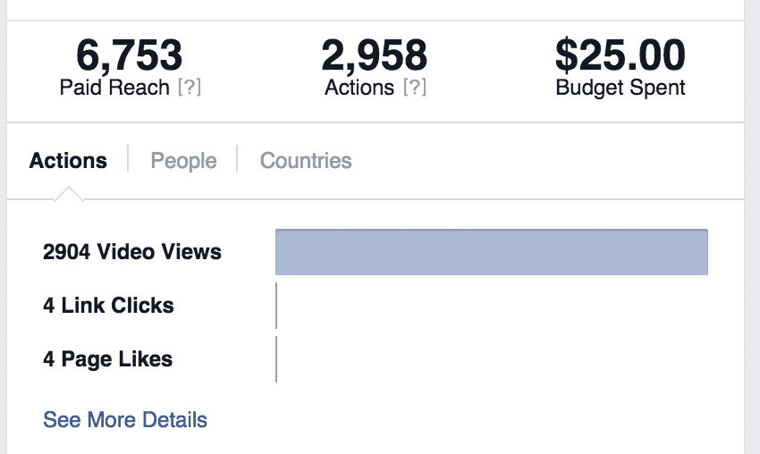
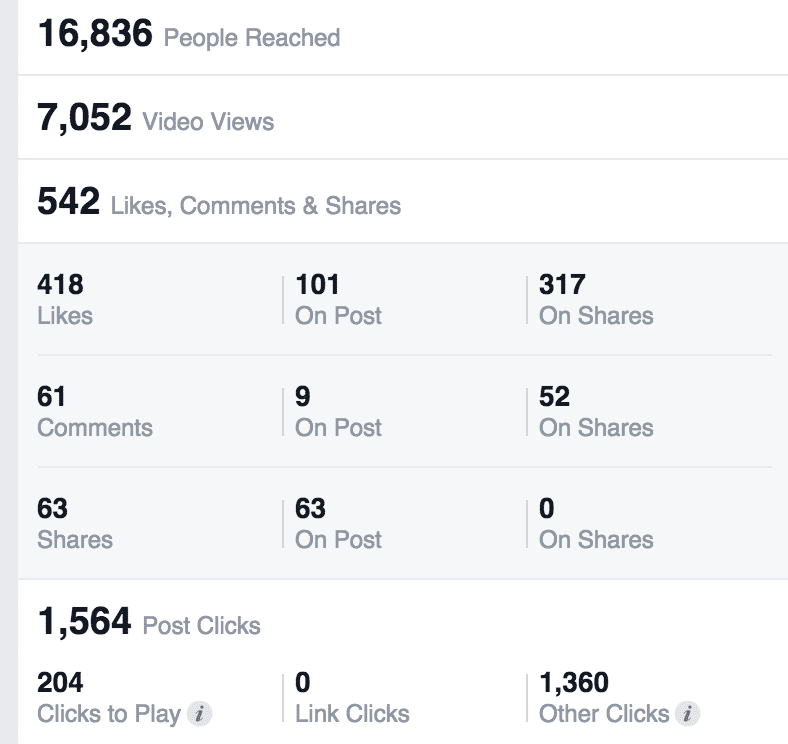
The result were 16,838 total reach with 6,753 of those being paid. Thats amazing! The difference: amazing content people wanted to see! Screen Shot 2015-10-19 at 11.00.29 AM

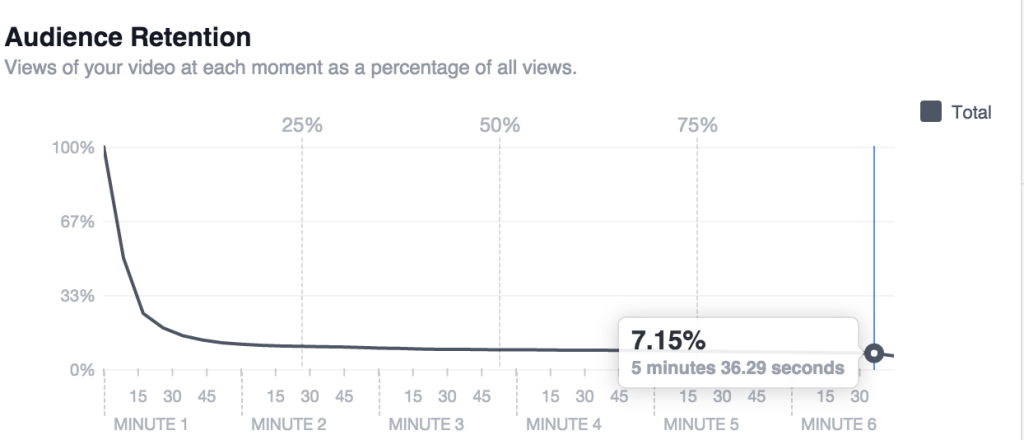
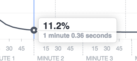
Now lets dig into the video statistics. Of that 16,838 people who saw the post there were 7,052 people who watched the video. 17% of those reached with the post watched some of the video. Now we can see through the audience retention panel that very few made it very far into the video. But the vast majority that made it 45 seconds in, made it to the end of the video. 7.15% of the 7,052 people who watched it at all is: 504. 504 people watched the entire video!

Screen Shot 2015-10-19 at 11.04.47 AM

Now in our context, the video was nearly 6 minutes long. It was a time investment for our audience to watch. This video was designed more for presentations than social media viewing. The story was too long to fit into an ideal :30-1:30 video. I feel like the 504 is a great number for completing the video.

We can also learn from the Facebook stats that the average watch time was 42 seconds. I also know that that if they made it 1 minute in, almost all of those watchers made it the rest of the way through the video.

Screen Shot 2015-10-19 at 11.06.30 AM


What other measurable things did we get? The page gained 32 new likes and the post had 418 likes in total. 101 on the pages post and 317 on the shares of the original post. This is an impressive number. There were also 63 shares. People loved the content. The content is king!

All of these measurable point to a marketing win for a small nonprofit that just had the chance to get in front of 16,800 people for a very small amount of money!


Screen Shot 2015-10-19 at 11.06.56 AM


An ounce of prevention in customer experience!

Screen Shot 2015-10-12 at 9.24.35 AM


(This blog post is predicated on the understanding that you or your business will fail at delivering a product or customer service occasionally. If you do not think this statement is applicable to your business, then this post will not be helpful! Here is a link that will help.).

[bctt tweet=”Let’s start by saying that sometimes you cant recover from a bad customer experience.”] Sometimes people will not like you enough to give you a second chance. That is their right and you probably shouldn’t hold it against them.

With that in mind we have two areas of work in dealing with a bad customer expereince. Preventative Care and the Aftermath. This blog post is about the preventative steps to take to help prevent a bad customer experience. Next week we will look at dealing with the aftermath of a bad customer experience.

The wise Benjamin Franklin once said, ” An ounce of prevention is worth a pound of cure.” This is absolutely true in the case of customer experience. What does that ounce of prevention look like for customer experiences?

Culture:

Culture is the way of life in your organization. How you should handle customers is part of the culture. It is something observed by employees everyday and it is up to the leaders in the organization to set the tone and the expectations. If the owner has the habit of taking criticism personally it will pour over into the other employees and hurt their customer service.

The culture of your organization needs to value the customer. I am reminded of a small family owned grocery I used to work at in Illinois. Customer service was one of the primary values of the store even though it was not on the wall. Everyone know that it was important to the organization because the owner exhibited it daily. What example are you setting for your organization?

Are you reward those who take care of their customers well? Are you encouraging good customer service behavior?

Training:

Are you setting up your employees to win with the right training? If you are having regular customer service failings or bad quality products then probably not. Evaluate your training regularly. Think about the goals you have for an employee and then consider how your training can bring out those qualities. Training is more than knowing how to put the widget in the box! Training should help us to know why we put the widget in the box and how to treat the person buying the widget.

Do not assume that your employees know how to treat the customers. Spell it out explicitly so there is not miscommunication. A Failure to Communicate helps no one. It is your responsibility as the owner to communicate clearly to the employees.

Expectations:

Think through the expectations you are setting as the business, not for your employees but for the customer. What tone are you setting when they come in? Are you accurately portraying your business in your marketing? Setting the tone for a expensive steakhouse when you serve cheap fried chicken is setting your customer up to have a bad experience.

Are you properly branding yourself?

Have your customers been confused on a regular basis about your pricing or where to go when they enter the business? Do not expect the public to learn over time! Remove as many roadblocks to a great customer experience as possible! Put in new signage, re-due the pricing structure, move the customer check-in to make their experience easier. Failure to change is not their fault but yours!


Let us all work to give our customers the best experience. A small cost in time and money now will pay off huge in the long run!


Social Media Fail: Facebook Privacy Hoax

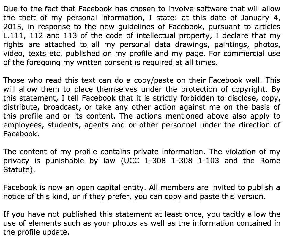
This months social media fail comes from a hoax that circulated recently. A rash of posts starting coming across my news feed last week. The posts people were sharing were pretty much a copy of this:

Screen Shot 2015-10-06 at 1.44.12 PM


There were also a few variations with different news entities mentioned and different dates. But regardless of what you post, it would not over ride the Terms and Agreements we all click on when we sign up for social media. Your information is used to help make Facebook Money. That is why you are able to use Facebook for free!

While you retain rights to own your content Facebook retains the right to use it. This is usually show in things like your profile picture being used in advertisements, “Like this page because John Doe does” with a profile picture.

John Oliver did a great piece on this on his show last week. (*Just as a warning there is some language*)

Customer Spotlight: ARM Banquet Video

Recently I completed a video from Area Relief Ministries. This video was many hours in the making but it was a pleasure to work with the staff and tell a little of their story. Area Relief Ministries (ARM) does amazing work in our community in helping fight poverty.

This video presented some specific challenges. There was a variety of locations and people which while time consuming and technically tricky added a lot of life to the video. One of the trickier parts was combining elements from the diverse functions of ARM into one video.

The video ending up coming together well! This video was produced in conjunction with Our Jackson Home and was sponsored by the Eblen Agency.

Instagram releases new image size!

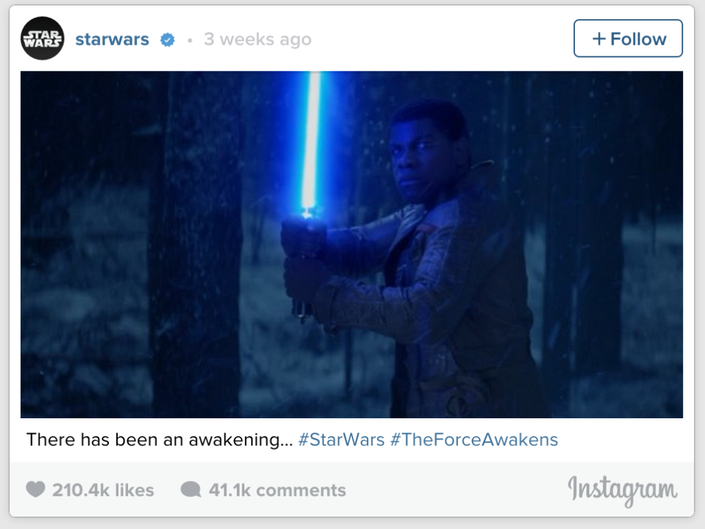
Instagram released a new image size a few weeks ago and did so by partnering with the new Star Wars move. This was a great marketing move as lots of people were excited about the movie and its popularity allowed it to skyrocket up the new style without having to directly point it out.

Screen Shot 2015-09-22 at 11.19.18 AM

This new perspective width gives you more letterbox format. This means that you can now take a photo in landscape mode on your iPhone and get the entire photo onto Instagram.

For more people this just means there will be more food in your Instagram feed but it will allow some more creativity in the Instagram space.

Now if we could just schedule posts in Instagram and have multiple accounts…….

Facebook now has stock photos!

Facebook is making strides to be more friendly to advertisers. From the inclusion of a support staff for questions to increasingly opening more and more analytics and targeting options, Facebook is actively striving to make the experience better for advertisers.

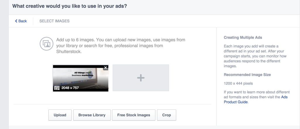
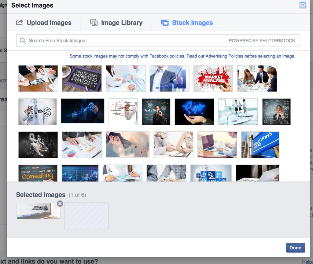
One step they have taken is to add free stock photos for ads on their page. More than just stock photos, they are from ShutterStock, which is one of the premier providers of stock photos on the internet. Even if you have a photographer or imagery this might help in a pinch.

For example: While working on a recent ad for my business, the option was given to me to use “Free Stock Images”.

Screen Shot 2015-09-16 at 1.49.21 PM

They also preload some images they thought I might like based on my product.

Screen Shot 2015-09-16 at 1.49.46 PM


This is a great product upgrade for Facebook. But almost always, photos of your product and service will be better that stock photos.


Land Rover’s Storytelling on Instagram

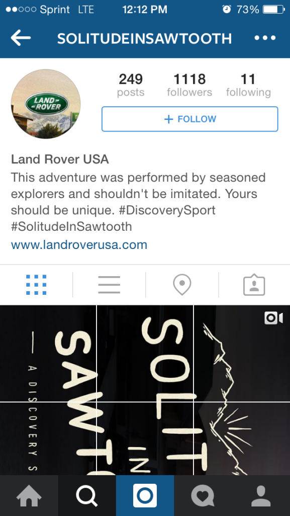
Land Rover took creativity on Instagram to a new level recently. It uses Instagram in a way I have never see or thought of before. It uses the grid of all the photos to make its own image composite image. It took a lot of planning to pull off but when you go to either of their two accounts: Solitude in Sawtooth or Brotherhood of Wonderstone (click for the weblink but it looks better on your phone) you can scroll continuously down through a seem-less image story. Additionally  there are videos scattered throughout that have different tips for wilderness survival and fun. Beautiful job Land Rover!

IMG_1881

Customer Spotlight: Barnfest 15!

This month I wanted to put a spotlight on one of the videos I produced this month.
Barnfest is going to be an annual free Christian concert at the Barn at Snider farms. This year the event featured Humble Tipp and Crowder.
This video was shot by my wife Renae Adelsberger and myself. Aerial footage was provided by Wes Harris of Wes Harris Statefarm. I also edited the video.

Candidate Logos Part 2: Republicans (Part 2)

Even though the election is not until next fall, the presidential campaigns have kicked off. While this is super frustrating to many, including myself, one of the upsides is you get to see lots of important branding. In this series of posts I am going to be evaluating the top candidates logos. How do I determine the top candidates? I used this study by the Washington Post.  This will be a three post series. The first post will be dedicated to the Democrat candidates and the next two will be dedicated to the Republican candidates (because there are currently so very many of them). (Read about the Democrats Logos Here and the first half of the Republicans here.)

Screen Shot 2015-07-21 at 4.51.09 PM

Rand Paul:

Visual appeal- 8
Symbolism- 8
Execution- 8
Total-24
Rand Paul is a man on fire. He wants change and with this aggressive logo, I think he communicates that clearly. It works well in different colors and it is my favorite. Simple but effective.


Screen Shot 2015-07-21 at 4.50.26 PM

Mike Huckabee

Visual appeal- 6
Symbolism- 2
Execution- 5
Total-14
Nothing crazy going on here for Huckabee. If there is intentional symbolism here, I am completely missing it! Instead it looks like they selected some random abstract shapes and threw in a few stars. And the kerning between the K and A is way to close.

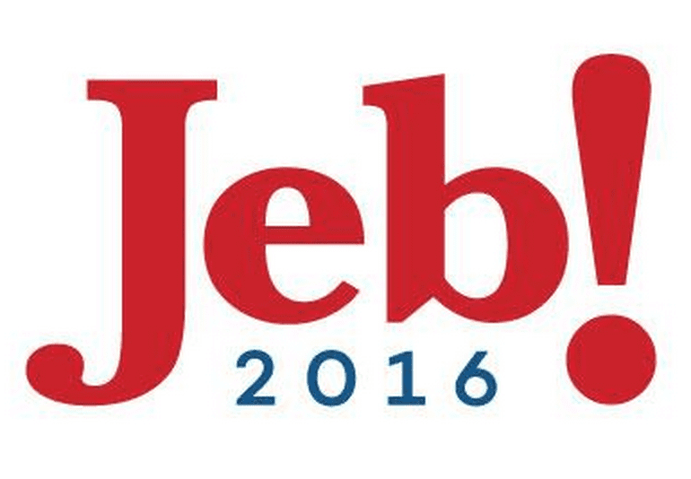
Screen Shot 2015-07-21 at 4.49.46 PM

Jeb Bush

Visual appeal- 8
Symbolism- 4
Execution- 8
Total-20
Well someone is clearly trying to avoid associating himself with his brother. The natural move in a family such as this would be to invoke the fame. This is the most light hearted of the republican logos. I think the choice of an exclamation point is setting him up for a alternate logo with an upside down exclamation point trying to court the Spanish speaking vote. Also what an interesting b.


Screen Shot 2015-07-21 at 4.49.22 PM


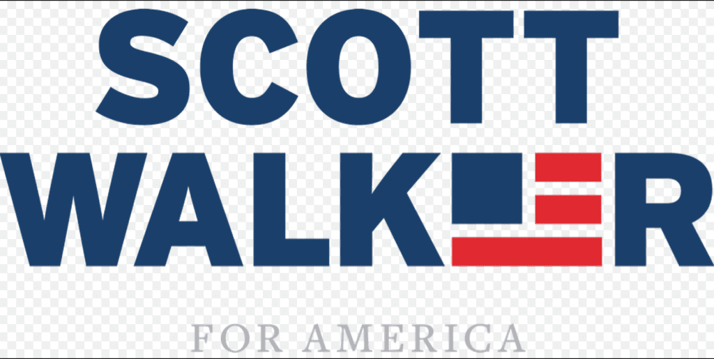
Scott Walker

Visual appeal- 8
Symbolism- 8
Execution- 8
Total-24
Probably the most creative inclusion of American Imagery this year. The block flag in place of the E strangely works for me. I think it would even be clear in one color. I feel like this candidate is a strong American loving candidate. Mission accomplished logo.


Screen Shot 2015-07-21 at 4.49.00 PM


Donald Trump

Visual appeal- 4
Symbolism- 2
Execution- 4
Total-10
Trump doesn’t need a creative logo. Everyone knows who he is. I think that has more to do with his poll ratings then his true popularity. But this logo is exceptionally plain, thus the low rating.