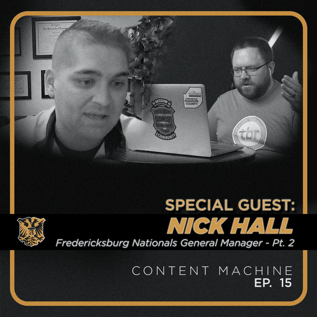
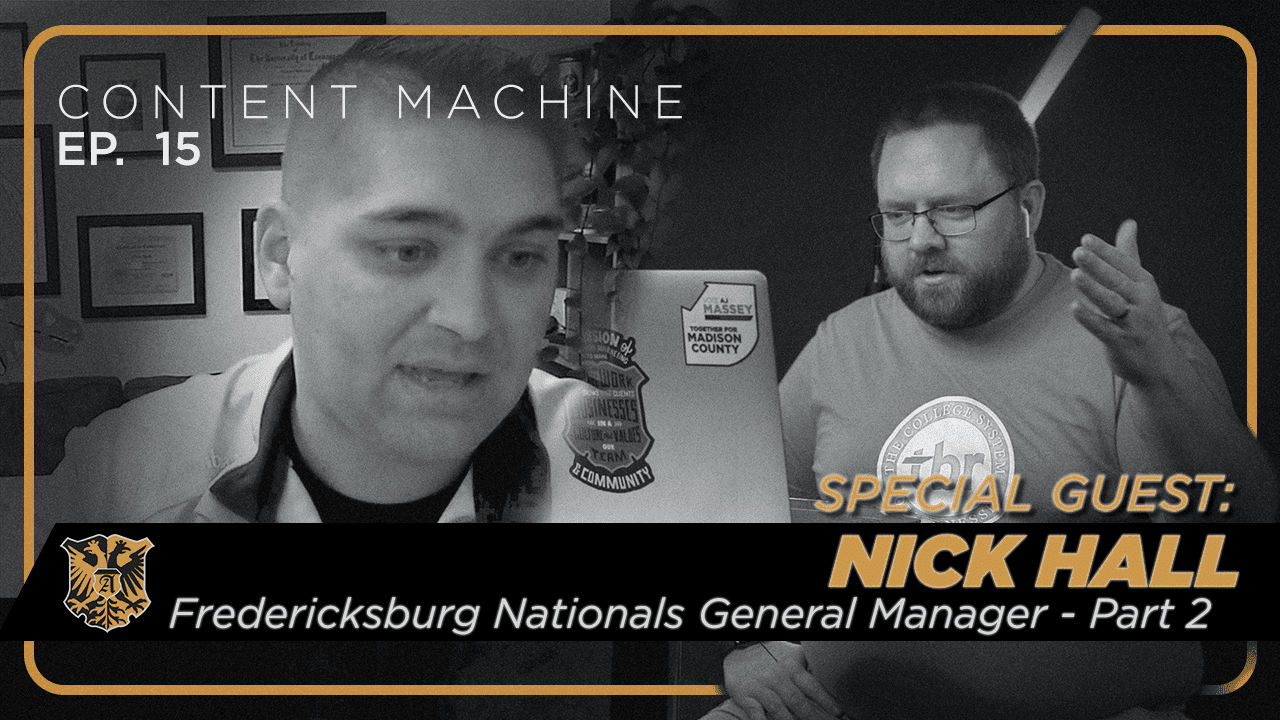
Here’s part two of our interview with nick Hall, the general manager of the Fredericksburg Nationals baseball team. So have you had things that you’ve seen that maybe bring the attendance above what your average attendance would be for that night? What are some of the things that have just been super home runs that have really bucked any attendance trends?
I mean, it’s definitely, and this is not a secret in the minor League baseball world. It’s fireworks. Fireworks. People come out for fireworks from all over. That’s not necessarily a secret. If you go to any market that has a minor League baseball team, there is one night a week that odds are they’re shooting fireworks. I would be willing to bet that’s their highest attended game for that week. That’s for sure. I think that was the same back in Jackson. That wasn’t Jackson inventing the wheel or anything like that. That is just the nature of it. We are human and we love to watch stuff blow up. It’s just you know.
No argument here. You mentioned your mascot a minute ago. I did want to bring him up because it’s an oddball mascot. I don’t know if does he predate Gritty?
He does, statistically, yeah. Our mascot is Gus. Gus is George Washington’s childhood imaginary friend. Gus has been here the whole time. When George went off to fight for our independence in the Revolutionary War, he did bring Gus with him. Gus was there the whole time. If you zoom in enough at the painting of George Washington sailing across the Delaware and you hold it up, you know, like national treasure, you’re not going to need the lemon, all that stuff, and you do all of that, you’re going to see Gus standing right there behind him. Gus was there. Gus, naturally, naturally. Gus was there the whole time. Gus was there the whole time.
We’ll put a picture of Gus up on the screen here or something because Gus is an odd looking character. Gus is what.
We call in the industry nightmare fuel.
Well, I originally wrote in this question your horrifying mascot, but I changed it to oddball mascot. And my kids walked in when I was getting prepped for this episode, and I had a picture of Gritty on the screen. And Gritty from the Philadelphia Flyers is obviously… They’re in the same mold together.
It would be going away from Gus’s back story. Gritty is a huge part of the inspiration of Gus. There’s no doubt about that.
And it’s just so stereotype shattering. What was the thought process? And then how do you guys use Gus in a regular basis to help promote the team?
For sure. The thought process of Gus was twofold. For the longest amount of time, everybody figured that George Washington was going to be our mascot for obvious reasons, George is from here. But let me tell you, when we really did a deep dive on this, this was brought up to me and I just sat there and I was like, We’re flirting with disaster by doing that. Because let me point out some things. What are the funniest things that a mascot does? One of them is dancing.
Yeah, they’re self deprecating generally.
Yeah, self deprecating. What would we have done when George Washington got up and shook his booty at the crowd?
Yeah. You had a George Washington mascot twerking.
Yes, it’s over.
Like you might be on the front page of Fox News.
100 % because people around here, everybody knows George Washington. People out around here eat, breathe, and sleep George Washington, though. He means so much to this community. It’s the branded throughout this community. So if we do one thing that’s not… I mean, not even talking inappropriate. Well, let’s go one thing that’s not historically accurate that George Washington himself wouldn’t have done. You’re talking about knocking over a kid’s Pop corn. Well, not George Washington. He would never stoop that low. You see what I’m saying? That was the first thing, this realization that, Hey, the most obvious thing is probably our absolute worst thing that we could do for this community is make George Washington an actual character that’s out here. Now, he is a character that’s out here because him and his mother, both being from this area, we do a race every single day, every single game, and it is a mother son race, relay race. They come out for that, and then they send autographs, and then George is put away. For the exact reasons that I just mentioned, you have to be careful with that image. The next thing is, well, what are we going to do?
We looked around all of sports to find the perfect mascot, and gritty was a big part of that, and so was Blue from the Indianapolis Colts.
If you ever get a chance to look at him. He’s a horse, though.
Blue’s a horse. He’s a horse. And for a while, when we first came up with the idea, it was going to be George Washington’s horse. Until we found out the literal mascot that we thought up is currently being used by the Indianapolis Colts. So that also brought on another layer. Gus gets the cut of his shirt from Winnie the Pooh. We thought it was funny to make the mascot show off that belly even more. The tail of Gus, if you notice, looks like a little dinosaur tail. The reason for that, which you might not know, is about 30 minutes from here, the largest dinosaur fossil in the United States was found. Kind of neat. So we’re like, Yeah, let’s make him a dinosaur. But then we realized, He’s got to have a bullet. Why? Well, that actually has no significance to the area. We just feel as though Gus would want a bullet. It’s awesome stuff like that to be able to help us out and make that work. After going through the process, we ended up with Gus. There was some definite hesitation, but the great thing about him being so crazy is that everybody immediately was like, Okay, that’s pretty awesome.
Because the other thing, when opening up, one of the criticisms that we got as an organization is the creativity that went into the naming of the team. And what I mean by that is, minor league baseball is known for zany names. I came from Amarillo, just talked about Amarillo. We’re the sod poodles.
I drove past the trash Panda stadium on Friday.
Trash pandas. Absolutely. Akron is the rubber ducks. So when you have these great, great brand names that are like off the wall. But yet we went with the Fredericksburg Nationals. That is two full 45 minutes away from Washington. That means a lot to our fans. There’s so much pride in being an affiliate of the Nationals. When we first opened, we were coming off of a World Series victory. So there was so much pride in that. It was so important to keep that branding. So we had to set ourselves up for, if you will, that weird and zaniness. We had to bring that in other ways other than with the actual baseline brand. And so we were able to do that with Gus. And honestly, it’s been such a tremendous success. He is definitely the wild card of the stadium.
Well, if you do rebrand, the Fredericksburg Imaginary Friends sounds like a pretty fun minor League team name.
I love that.
I love that. So let’s talk about marketing and sales real quick. So a lot of your career has been built on selling sponsorships and partnerships. C an you talk about your thought process when you come to that?
Yeah, for sure. So I think when we talk about partnerships, talk about corporate sponsorships, we are talking about marketing inside of a baseball stadium. The number one thing that I love to talk about is sponsoring and partnering with live events. I could talk for hours about what it could do for your business, but when it boils down to it, you have a captive audience. You have them for three hours, hopefully now two and a half, shout out to the pitch clock, but you have a captive audience for two and a half hours. There is no muting, there’s no rewinding, fast forwarding, there’s no pausing. That message is there. It’s so important, though, you can’t have a commercial. You have to find a way to creatively brand what we are doing from an entertainment standpoint so that you link that brand subconsciously. You’re linking your brand with having a good time. If we were to just run commercials, it’s just going to fade into the background. But it’s important to be able to link something so important to a community, to link a having a great time and link your brand and your messaging all together. You mix those three things together, your brand’s image throughout a community or wherever that may be is immediately changing in a positive way.
And so that is essentially my entire career up until this point is based off of those partnerships and creating those subconscious links to a brand and what we do and how we are able to serve.
Our communities. Can you talk about some of the hottest partnerships that you’ve done? W hat’s something that’s turned out just a weird connection or a weird thing that they wanted to sponsor?
Oh, I have so many. And yeah, there’s been a lot, and there’s some that I’ve had to say that I have had to turn down as well. For instance, you do have to remember there’s still baseball going on. So depending on what’s going on, there are some lines that can’t be toed, such as, I have had people want to sponsor the other team when they get hit by a pitch. I can’t handle that. The injury lawyer. And although funny and great, there is a chance when that happens, somebody could get hurt.
On the field.
And that now makes you the bad guy. So you know what I’m saying? So you have to be able to think about those things. That is one of the ones that I think… That was one of my favorites. One of my favorites that I have done I’m going to go all the way back to Jackson. And it was Bird & Bird Associates, a law firm in Tennessee. We did a Bird Mobile water delivery to umpires once a game. We got an intern to dress as a giant chicken and drive out in a little VW remote control child’s car. This chicken is three times the size of this car. He just rode this little bird and we call it the Bird Mobile. The Bird Mobile would ride out to an umpire and he’d handle a bottle of water and then he’d ride off on this little bird. It was just hysterical. There was quite literally one time that it did… I mean, it was probably rated for what, 50, 75 pounds, something like that. And this 150 pound gentleman was riding in this thing, and there was one time that it just broke on the way back, and we did not know what to do.
And four of the promotional squad folks sprinted out there, and this was not scripted, and it was the funniest thing I’ve ever been a part of. And each of them picked up both the bird and the Mobile at the same time and carted it off like it was a stretcher. It’s that stuff. It’s trying to find, can you find a way to link your brand in a way that furthers the entertainment that the stadium is providing? I could probably talk for an hour on some of the weirdest things that we’ve done. I’ve had a funeral home sponsor the visiting team’s lineup announcement. The catchphrase was, The Fred Nats will beat them and we’ll bury them. It’s funny stuff like that. It’s coming up with that creativity to link the two. It just becomes everybody’s favorite.
Now, you’re in a leadership role. You’ve been in a leadership role for a long time. Can you talk about the process of going from selling those things directly to having a team of people selling those things directly?
I can’t lie and say that that was the hardest part because when you are concentrated in one avenue, it becomes your baby. It becomes your baby. So to give up control over that is a difficult avenue to be in. But at the same time, then you have everybody else’s department is now starting to come to you. There’s just this realization that you’re just not going to be able to hyperfocus on that one thing. It would be a lie to say, Oh, you know, that’s just the hat that you put on, and it’s an easy transition. It takes some time to be able to really be able to do that. I will definitely say that there’s plenty of times where I miss just being able to concentrate on one avenue. Oh, my goodness, there’s so many times that I would love to give up 90 % of what I do and just go back to that for a whole week. But I would be lying to say that it was easy to do to make that transition, but it is a transition that if you’re able to do, it’s so positive. It’s so very positive. Part of that is having trust in the person you’re giving it up to.
That’s a huge piece of it. You have to make sure that you have the right person in place to be able to take the reins from whatever that was.
Thinking about that thought continued is like, how do you approach leading that organization then?
You’re talking about leading it from the whole organization standpoint? Yeah. For me, I like to think this, too, because one cool thing about working for so many different managers is that you learn what you’d like to work for, but you probably also had a few times where you learned… I’m going to vow if I’m ever in that spot not to do that one thing. Sure. It’s all obvious things, but when you’re at the other end of it, sometimes you really learn like, Hey, that really does make you feel bad. The intent wasn’t there to make you feel bad. I can almost guarantee the intent wasn’t malicious, but that doesn’t feel great doing that. One thing that I like to do is, for better or for worse, I know it’s not everybody’s cup of tea, but I pretty much tell people, Look, if you are coming to me with an issue and don’t have a solution, I want you to know that to me means you are handing your problem over to me wholly, or communicate it that you need a little bit of help or whatever that may be. I love when somebody comes to me, they’ll describe an entire problem, and a lot of times I’ll just say it and be like, Hey, okay, great.
Present a solution to me by tomorrow at five o’clock and let’s make a decision. They just look at you and I’m like, I can’t solve that for you right now, but you can. I think that is my biggest strength, I think, is that I really love to be able to give people the ability to come up with their own solutions and execute those solutions. I think a big reason for that is one of the calling cards of a successful organization, and this is not just baseball or sports, this is anything, is buy in. Buy in towards the vision. One way to get that buy in is to actually give your staff the ability and the feel that this is theirs, that this is fully theirs. That to me was the thing that I learned when I was given that and I wasn’t in the leadership role yet. It moved the needle for me in my career when I felt as though, Oh, man, I have to make this work because they let me do it exactly how I wanted to do it. So I can’t let it fail now. Yeah, it’s on me. I get it because now it’s on me.
I don’t have anybody else to blame, so therefore, I can’t let this fail. When I realized that and then got into management role, I was like, You know what? I didn’t know if they meant to do that, but that was genius. And so that’s one of the things that I like to do is if you have a department under me, I’m going to ask you, Okay, well, how do you want to do it? I know what I want the results to be, but how do you want to get there? I like to think that that’s a strength of mine that I let everybody come up with their own plans and present them.
All right. Well, nick, thank you so much for joining us. If someone is in the Virginia DC area, your season runs along with MLB season?
Exactly with it. Our opening day is April seventh. Okay.
Well, thank you for taking the time, nick. It’s nice to talk to you again. And good luck with this season of The Nationals.
Absolutely. Thank you, Kevin, so much. Thank you for having me.
Thank you all for checking out the Content Machine podcast. If you found this helpful, please be sure to subscribe. And if you are a baseball fan, make your way to Fredericksburg to check out a game at the Fredericksburg Nationals.

