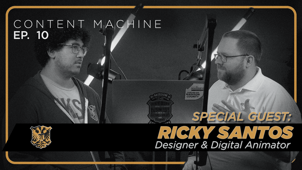
Well, welcome to the Content Machine Podcast. This week, we are joined by Ricky Santos. Ricky was the first hire we made at Adelsberg Marketing, and we’ve been thankful to have him on the team ever since. It’s going on, what, five?
Five, no, almost six years.
Almost six years. And it’s amazing that he’s been able to put up with me for so long. But Ricky is one of our designers and our lead motion graphic artist. And so this week on the podcast, we’re just going to interview Ricky and talk about some design trends. So, Ricky, tell us about a design trend that you’re seeing.
Yeah. So I guess one of the thing we can think about first is when it comes to trends, it’s not something that everyone might be doing. Although we’re not selling all of me switching to using these things. It’s just something that I’ve seen around areas in graphic design, motion design, website design, that more people are starting picking it up. The one of the first things I’ve seen is a little bit more pulling in some vintage elements, but not necessarily copying designs from 1960s, 1970s. But maybe we’re just pulling in colors or fonts or some of the language that they were using at the time.
And we’re not just talking like putting distressed things on.
Stuff, right? Yeah, it’s not making it.
Look old. When you mean colors and fonts, what’s an example of that?
So for one of the things, you look at a home goods company called Pine Apple Collaborative. And one of the things they use a lot of is just pulling in mid century modern colors. A lot of mid century modern design was very busy in some areas. We have a lot of patterns and shapes, and I think a lot of that people don’t really like right now. But the colors and so they feel more homey. They look good on an olive oil bottle. They look good on… Your laundry detergent doesn’t just look like a tied laundry detergent. It looks more esthetically pleasing. Yeah, exactly. Then something else, another company that is doing some of that is CNET, the online electronic and lifestyle review website. They had this went through the recent redesign and from their old logo, which is a very… Not lifeless, it’s not good way to put it, but didn’t have much personality. But their new logo pulling in the older font, some of their illustrations that they use throughout the site have some of that retro cyber punk look to it as well. More 80s looks.
Looking at the logo here, it has extremely aggressive seriffs. Too much, in my opinion. The T almost looks like a Times New Roman T, but everything else is.
Out there. I think that’s one of the things that looks like something we see from the Art Deco style that happened around the ’70s and ’60s. All of the fonts were elongated, and each little element of the font was a design feature in itself. It wasn’t just a little addition to the font.
Yeah, that is a whole identity just in that font style for sure.
But compared to other text sites that is not. It’s very different. Yeah, that we see everywhere else.
So vintage, but then you also say that retro.
Is being seen. Yeah. So when I think of retro, I think of bolder lines, bolder colors, bolder fonts, really. And I think I’m thinking more of the hippie, trippy styles that we see some places, but also pulling in some of the maximumism style, which is having a lot of bright colors, a lot of patterns and taking up the visual space using all those elements. We can see one here. This is a designer’s heat. This is his profile. Gleb.
I’m going to get, sorry. Sabrin is enough.
That’s as close as anyone can get. But he’s using these old looking… I think of my Game Boy Advanced.
Yeah, very Game Boy original boxes and fonts and shading.
To create a very easy to read website that is more fun. That’s a lot of his styles is that he is… This is the thing he’s known for is doing this work.
His domain name is gleb. Sexy.
You got to have a very bold personality to have that as your domain name. Absolutely.
But very retro.
But also, it’s something we can look at is what Target is doing and the new styles that they’re putting up for their clothing and their interior design. One of the things right now is skinny jeans are gone. And same way I feel like in design, a lot of very structured grid systems, very structured print layouts where your header is always the largest thing. And then you have other little events that follow a very hierarchical… Hierarchical? Yeah. Words are hard today. Yeah. The big words. So you know the structure of everything is little bit, but I think the more retro design, it’s a little bit looser in terms of the rules that you can follow. So another example is, it’s a fan favorite and some of our team members is Olly Pop.
Alex on our team can’t help but drink Olly Pop. Olly Pop, if you’re listening, we got a brand deal for you.
But you can see there, it’s not just like a the Coca Cola logo or some bubbles on it. They’re using some of the little bit more retro illustration style to make that the center of attention. And then also on their website, the fonts they used are fonts that we see in old magazines instead of websites.
And there’s an interesting juxtaposition here with a new soda written in a very old font style. And then you mentioned here that black is taking over.
Our screens. Yeah. So once Apple finally started to implement dark modes on their phone, a lot of websites, a lot of apps started to have black as the main color instead of white. I think a lot of that has to do with our phones are better at showing black. Most people have iPhones. in America. I love that a lot of the screens can show the text on black is right now because of how good Apple has designed the screens. I think that has driven a lot of people to start designing in black. Instead of having white space, your main element is darker.
Well, because you’ve got the technology that shows the screen better, shows true black. That way you can have the contrast to read it. And then I think just big point about you bringing up about dark mode is dark mode makes it where everybody gets used to seeing that. So it’s not as weird to just see it all. It’s like not a goth website because it’s all black. It’s just like this is normal now.
And I think we also, from the pandemic, everybody started to watch content on their screens a lot more. Watching in a dark room, if you go out from your show and it’s a really bright screen, that’s going to be a bad experience. And so having a darker screen that helps your eyes not have that such stark change all of a sudden, I feel like that’s another big reason I live. When you go on Apple TV or Netflix, it’s mostly all black.
And then you had an example here with a Fay app?
Yeah. So they are a… I don’t know too much about the app itself, what they do. I think it’s more of an investing dashboard, but they have a very dark dashboard look. I mean, the whole website is basically black. It’s like probably 90 % black. It’s beautiful. Yeah. And then I think because of the darkness of it, it looks more premium as well. It’s got to have the black Lexus feel. You have to think of that. But also Apple, when you look at Apple, some of their products, like the AirP ods Pro, that’s all in black as well. They have some of the products in white. They have some of the products in black. I think they’re more premium products. They show in the black screen to make it look a bit more, make it feel more premium.
Absolutely. Now, the last thing that you had here was AI Art, which is a controversial subject and one that we should be thinking about. What are your thoughts on the AI Art?
I think there’s two branches of views on the AI Art. Right now, there’s a lot of people who are worried that people are just going to stop making art and just use AI to make everything. But then there’s another group of people who are looking into AI Art as another tool in their toolbox to help them quickly find… Maybe they have an idea in the end of their head and they’re having a hard time getting it out of their head into paper. And so it’s a quick way to push it onto the paper and just have different variations that they can jump off from. This is using Midjour AI, which is a really advanced AI system that does pretty realistic stuff.
Yeah, because that’s an AI image right there. Yeah, this is AI. So we’re looking at a Prata bag AI image that has a wine bottle holder in it and it looks real.
I do a lot of the work on the side. One of the things I’ve thought about doing is, if I was to make a new type of backpack, what might that look like? I know how to make all the hardware points for it, but having weird shapes or different ideas, that might be a little bit harder too.
And you might be able to test market it, too.
Another example is in architecture. It’s a lot easier to quickly change up shapes of a building than to actually build up a building and just see if.
It works on that. So we’re seeing an example of a Nike concept store and it looks like potentially Japan. I think so. That looks brilliant. Looks like a cross between Nike and Apple Store.
Then on the other end of it, there’s a couple of products, AI products that are built into Photoshop and illustrator where you can… Let’s say I’m designing something for a website and I need an icon of a tree. Instead of going out and spending some time designing that icon of a simple little tree or going out to another website to pull an icon off of that. You can quickly type in there and it’ll make a one out of one icon for you real quick. So you can pull that out real quick and start using that and then you maybe can change some elements of that to make it your own still or.
In Photoshop. Or if you’re making just a sample or a concept that saves a lot of time. I think that’s going to be something that we continually have to confront over the next couple of years. And it’ll be interesting to see where the legal ramifications fall out at, and ownership, because AI is just regurgitating other things that it finds. And there’s already been lawsuits filed. And then also the legal ramifications of… Some people are putting stuff into AI generators that the public doesn’t need to know. And so it’s going to be interesting to see how people, if their data is as safe as they think it is and all that things. But those are things that we don’t know the answer to for a few years, probably. Well, Ricky, thank you so much for sharing some design trends that we should be aware of. And where can we find you online?
Instagram? Instagram, yeah. I don’t have much on there, just @RickySantos955.
But you can find your leather working stuff.
Yeah, it’s on there.
Everyone’s got one. What’s it called?
It’s the same name. Ricky Santos.
So I’ve got some Ricky Santos leather stuff at my house. I approve and encourage people to go buy that. But thank you guys for checking out the Content Machine podcast. Thank you to Ricky for joining us this week. And be sure to subscribe. And if you found something in this episode helpful, share it with a friend, text it to him, send them an email, check it out. We’ll be putting these out weekly, and we look forward to being back in your feed soon. Thank you.

