Major Changes Coming to Email Analytics

Tim Cook doesn’t giveth, he just taketh away. This time it’s inbox tracking. 

Most marketers are well aware of Apple’s recent war on digital marketing. The changes to tracking with iOS14 are just starting to be felt and the change of the direction and tone they are setting will change our ecosystem. 

But Apple is doing what they said back in 2019: “The future is private.” 

With the latest WWDC, Apple announced the next big swipe at marketers: Apple Mail users will have to opt-in to allowing email opens to be tracked. While the numbers are still being sorted out from the last update, it looks like most people will not be opting into tracking. Which is a reasonable step for most people to take when presented with the request to allow tracking.  Therefore it seems likely that people will not opt-in to email tracking. 

While this is currently just going to be in Apple Mail, it stands to reason that Apple sets trends in this industry. Remember how everyone made fun of the iPhone for dropping the headphone jack? It was not long till everyone else copied that.

The arms race will be interesting to watch: Will Mailchimp throw a public fit like Facebook did? Will Constant Contact develop a work around? Will Apple launch its own email service that doesn’t follow the rules?

What to do about it? 

Know that Apple is once again changing the rules. In the near future email reporting will be affected. 

-Make good use of the time we do have left by testing open rates on different types of headlines. Headlines will be awfully hard to test against each other when these changes take effect so use this time and make records. 

-Start building better content. Using the data you have currently and focus on making better emails going forward. Stop sending lower quality emails and focus on good ones. In other words, make it hard to not open. 

-Use UTM parameters in email messages. If you are not already doing advanced link tracking in your emails, now might be a good time. UTM parameters might end up being one of the first and last working reliable analytics. 

-Diversify your marketing methods. Email will still be a good tool to use. But as Google tries to sort people’s email for them, and Apple takes swipes at tracking, determine how else can you reach your people reliably. Unfortunately, I think this means that texting will continue to grow in its use by commercial entities. The second best attention feature left to use is push notifications, so getting customers to download your app will also become more prominent for marketing. 

Steve Jobs believed in hardware and software that worked perfectly together. This ended up creating a walled garden that was a hindrance to Apple for many years. But now, this walled garden, where they get to dictate the rules for so many people, may end up being the greatest advantage of our age. Apple sees the future as private for our benefit but also their benefit. It will continue to make our jobs harder, so begin communicating that to your clients to help set expectations of performance as these changes come down.

Graphic Elements (Collateral)

Graphic Elements (Collateral) 

When making sure you have all the builders in place, it is not necessarily exciting to think about all the many graphic elements that one might need to have on hand. Here is a list of essentials::
-Business Card
-Letterhead
-Signage
-Slideshow Template
-Notecard (you should be writing notes to people)
-Brochure/Sales Card
-Email Signature
-Facebook Profile Image
-Facebook Cover Image
-Twitter Profile Image
-Twitter Cover Image
-Youtube Profile Image
-Youtube Cover Image
-Other social media channels
-Social Media Template Image
-Video Logo Reveal
-Video Branding (Lower third, information screen, transitions)
-Email Marketing Template

Having consistent branding through all of these elements will allow you to have clarity in message and professionalism throughout your marketing. This will help you leave no doubt that customers are dealing with a professional organization. Also, an important note for all the social media channels: test these on mobile. Often these social channels change the crop of the image when on mobile so test it on both before committing to it. Additionally, social media profile icons are tiny on mobile devices so be sure to minimize what is in the image.

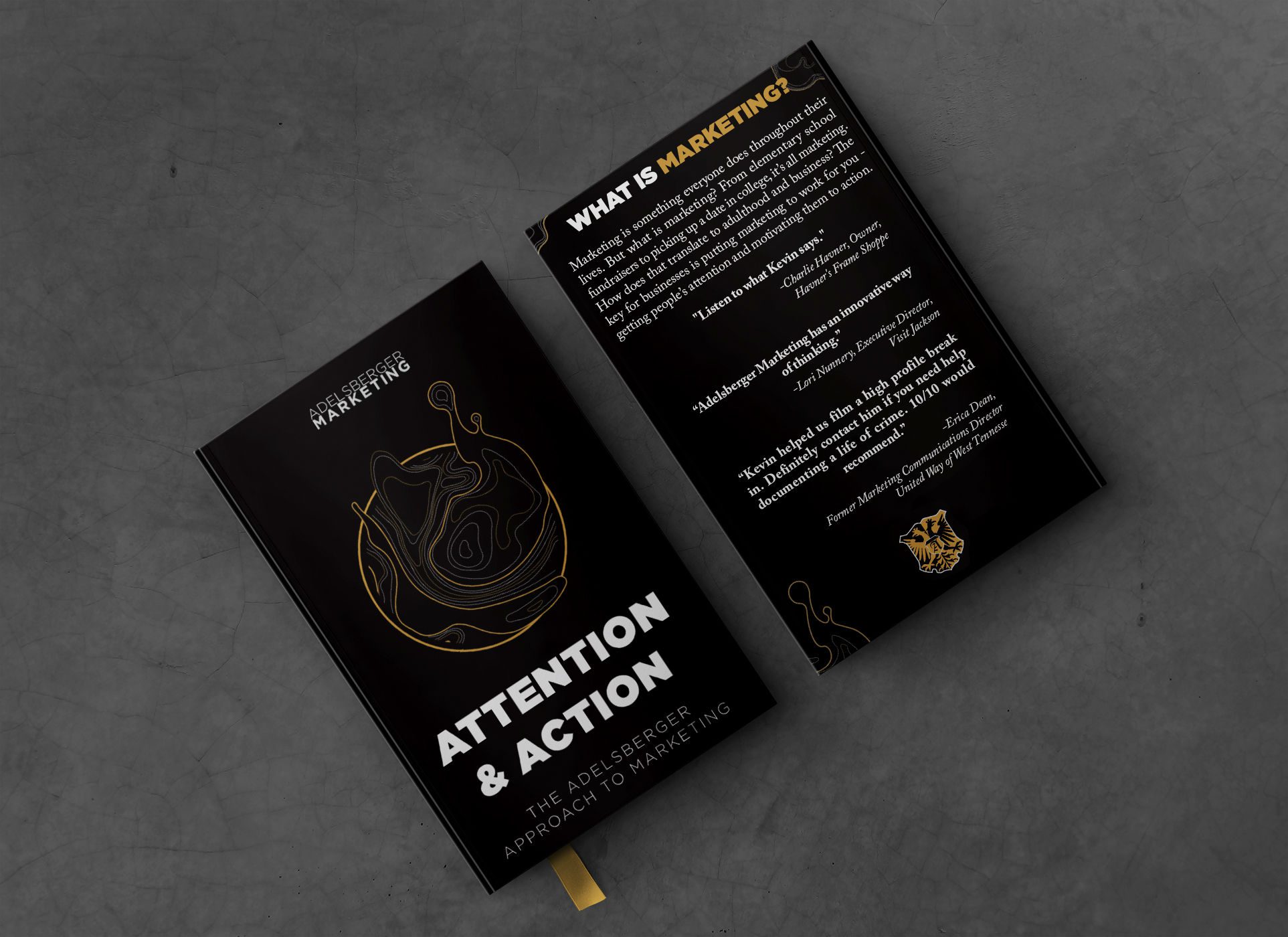
This blog post is a portion of Attention and Action. The book walks you through the marketing process that Adelsberger Marketing follows with its clients. You can read this book for free as a blog on the Adelsberger Marketing website or purchase on Amazon.com.

Messaging Elevator Pitch

Messaging Elevator Pitch

The classic imaginative scenario, you wind up on an elevator with a potential customer or investor and you get 60 seconds (or less) and what do you say? Do you bumble through it or do you crush it? I hope you crush it. However, unless you are exceptionally good on your feet, without a prepared elevator pitch, you might be in trouble. So how do we come up with an elevator pitch? I think one of the greatest resources for this is StoryBrand by Donald Miller. The main concept of StoryBrand is that when you are thinking about messaging for your business, you need to think about how to make your customer the hero of the story and your business the guide that will help that hero succeed. A short marketing message should address, at the minimum: who you help and how you help them.

For Adelsberger Marketing, we realized that most of our customers come to us because they are having problems with digital marketing. They are either confused about what to do, scared to do something about it, or realize they do not have enough time to do it right. We wanted to position ourselves as the expert they come to help guide them through digital marketing. Ultimately we want them to succeed at digital marketing with our help. Our logo is a shield which invokes some fierceness, so we say, “We lead businesses to conquer digital marketing.” We then follow up with some ways we do that for people. I frequently add on to that core message based on who I am speaking to. If it’s a company I feel like needs our design services, then I start talking about who we have helped recently in that service area.

When thinking about a marketing message, we need to consider what our customer needs from us, not necessarily what we want to brag about. I may want to brag about our newest camera gear, but most customers don’t care. They only care how I solve their problems. Your marketing messaging should reflect that.

Our recommendation would be that you have a one to two line marketing message and a somewhat longer paragraph that both you and your team can spit out at any moment. When working on a longer form pitch, get into more details like: specific services lists, success stories, and notable client lists.

Once you have your basic messaging, it is important to keep it consistent across all your builders and drivers. You may highlight different aspects for different elements of your drivers, but for the most part, you will come back to this well of messaging again and again.

This blog post is a portion of Attention and Action. The book walks you through the marketing process that Adelsberger Marketing follows with its clients. You can read this book for free as a blog on the Adelsberger Marketing website or purchase on Amazon.com.

Branding (Logo, Fonts, Colors)

Branding (Logo, Fonts, Colors)

Branding is a fundamental part of any business and every company should have a good logo as part of the brand. Branding is a term that has a lot of different meanings depending on who you talk to; so we are going to define it. A brand is all the ways your company is represented to the world. Branding is the use of your logo and the imagery/materials that go with it. There are three key parts to branding: Logo, Fonts, and Colors. 

  1. Logo- The masthead of your company, the sign that, when used properly, people in your community will know over time and instantly connect with your company. A good logo can help raise the value of your company and raise the expectations of your service, which can allow you to charge more. A good logo should be memorable, work in one color, and work in all sizes. Will it look good both on letterhead and also on a billboard? Now we even need to think about how the logo will look when it’s tiny on your phone. Think about the Favicon, the icon a website puts in your web browser’s tab to represent your website, will your branding work there?  Think about where you will need to use the logo. Different mediums and uses may affect the design of the logo. A good logo will also not require updating every few years, so it’s worth investing in to get a good one made. 
  2. Fonts- To achieve consistency in use across design applications, certain fonts should be used repeatedly. For our company, the Gotham font makes a lot of appearances. Within fonts, there are sometimes different weights that make differentiating information much easier. Oftentimes, when a legitimate design company delivers a logo project, they will also deliver a family of logos and a guide on how to use them. Refer to these. If you do not have one, develop a guide of fonts to use. These do not have to be the same fonts as in the logo, but sometimes they will be. Be sure to include the use of fonts for special occasions. 
  3. Colors- Like fonts, colors are something that should be used consistently across the branding of a company. If your primary colors are red and blue, hot pink will have a hard time working its way into marketing. But if your company’s only color is Pink, like Lemonade Insurance or T-Mobile, you are going to see it in almost every element of their branding. Colors are more noticeable to the average consumer than fonts. It is important to be consistent over time. A good design company will provide you a family of colors to use when creating a logo. 
  4. Brand Identity Guide: All of these elements should be delivered to you in a branding identity guide and kit. We make sure our clients have all the logo files they need to use the logo without us, whether we were to get hit by a bus or they decided they didn’t like us anymore. The brand guide should contain information on: Logo types, color schemes, font names, colors, color values, and potentially things like messaging and terminology. 
  5. Vector vs Raster: If you are reading this and are not a designer, you need to know the difference between a Vector and a Raster file. We run into this all the time: We ask clients for a logo file and they send us a .jpeg. There are few things that make a designer want to pull the hair out of their head faster. A raster file is a static image file that does not scale. It’s almost like it’s printed on paper. If you stretch the paper, it will rip. In digital terms, it will pixelate and look horrible. A vector file is an image file that uses math to keep all the elements in proper proportion to each other. If you stretch it, it will expand and look great. A vector graphic usually comes with the following file formats: .svg, .eps, .ai and sometimes they are saved in .pdf. Rasters have their place. But do all designers a favor and learn where your vectors are saved and send those to people. We suggest you save them in a Google Drive or Dropbox folder that has your logo kit in it so that you can quickly send a link to any vendor.  

This blog post is a portion of Attention and Action. The book walks you through the marketing process that Adelsberger Marketing follows with its clients. You can read this book for free as a blog on the Adelsberger Marketing website or purchase on Amazon.com.

Introduction

Branding and Builders

When we work on marketing projects, we like to think of two categories: Builders and Drivers (a concept we are borrowing from Paul Roetzer and PR 20/20). Builders are things that we make that have a long lifespan. These are our fundamentals, the blocking and tackling of marketing. Nailing these components sets you up for success, looks professional, prepares you to convert inbound leads, and pays dividends in the long run. When you see an Apple or Nike Ad, you know they are an Apple or Nike advertisement. Their style is part of their brand. Companies that work on design are more successful than those who don’t, according to McKinsey (https://www.mckinsey.com/business-functions/mckinsey-design/our-insights/the-business-value-of-design#) When establishing a brand, these are elements that every company should have and have in good order.

This blog post is a portion of Attention and Action. The book walks you through the marketing process that Adelsberger Marketing follows with its clients. You can read this book for free as a blog on the Adelsberger Marketing website or purchase on Amazon.com.