What do we first think about when we look at a product or service? It’s not the company’s mission statement or net worth. It’s their logo.
A company’s logo is often their most valuable asset. It can move from the storefront to the envelopes; from the website to pens and pencils. That symbol should be able to convey who a company is quickly and precisely.
What makes a logo successful? I think these three general guidelines are great starting points for any company looking to rebrand or start-ups starting to thinking about their logo:
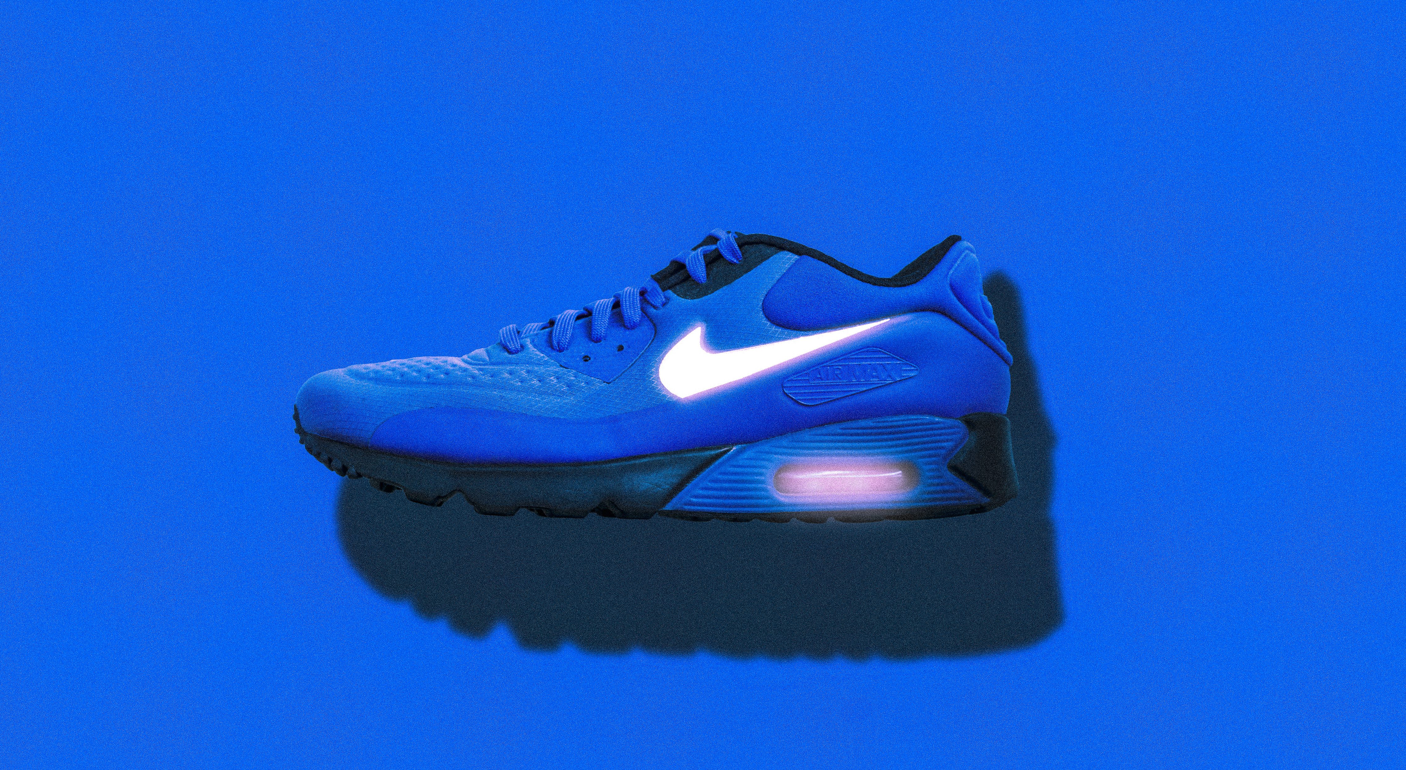
Brand Recognition: Why do we spend money on items that have company logos plastered on them like Nike hoodies or a a Coach handbag? It’s because we have a personal relationship or experience with the company that makes us want to be a part of it. Both Nike and Coach have done a phenomenal job making their logo such an iconic symbol of their brand. In part, that’s because they have a logo that is unique and makes sense to the brand. Logos that are just shapes or letters thrown together don’t have that same type of impact.
Timeless Design: In the same sense, logos that are designed with the latest trend in mind tend to need to redesigned in a couple of years when that trend falls out of favor. There’s nothing inherently wrong with redesigning logos, but the justification to do so must be more than just changing with the times. In 2010, GAP decided that they needed to update their logo and tried to do so by just changing the font to a more blocky sans serif and adding a random little blue square behind. The outcry and rage from their customers made GAP quickly revert back to their former logo which their customers loved.
Thought-out Design: During the time of the GAP fiasco, Netflix was in the middle of redesigning their brand as well. What they did that made that redesign successful was that they did their research and self-evaluation to guide the design strategy along. In the end, their new logo design had the same influences as the GAP logo did. But Netflix’s stayed true to what the company was about. So if your company is looking for a new logo, don’t look at what everyone else has already. Don’t be afraid to go for a logo that fits your own unique style and personality.
These three points won’t give you all the answers to what you’re logo should look like. But I think that they will help you find a logo that is true to what your company is about. And genuine honesty will also be what the customer sees and makes as part of their life.


