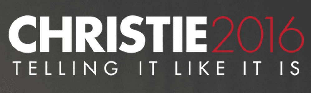
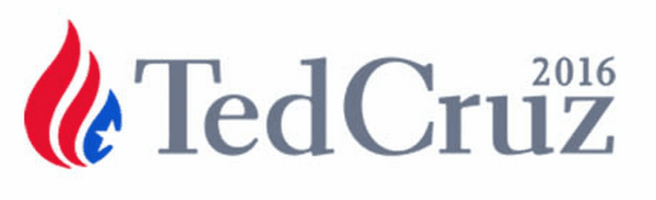
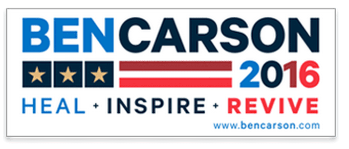
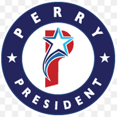
Even though the election is not until next fall, the presidential campaigns have kicked off. While this is super frustrating to many, including myself, one of the upsides is you get to see lots of important branding. In this series of posts I am going to be evaluating the top candidates logos. How do I determine the top candidates?
I used this study by the Washington Post. This will be a three post series. The first post will be dedicated to the Democrat candidates and the next two will be dedicated to the Republican candidates (because there are currently so very many of them). (Read the Republican Reviews
here and
here.)
One of the interesting thing is that both of the Democrats are basing their campaign image off their first name.
Lets start with the top Democratic Candidate:
Hilary Clinton
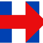
Ratings:
Visual Appeal:Â 4
Symbolism: 8
Execution: 4
16 out of 30.
Commentary:
•This logo comes off as very harsh to me, lots of straight lines and strong colors. I think this was an intentional choice to offset the potential perception of a softer female candidate.
•I appreciate the the attempt at symbolism but the arrow does not come out well in the execution. I think in a one color version the whole thing is lost. For me a logo absolutely needs to work in one color.
•I would have given a slight amount of space to the head of the arrow and the upright of the H. Another design interpertation would have been to leave the arrow as it is but add a boundary around the edges of the arrow.  I think in a one color version the whole thing is lost.
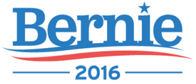
Bernie Sanders
Ratings:
Visual appeal 8
Symbolism 4
Execution 8
20 out of 30
•I find this logo extremely visually pleasing. The waves at the bottom give a softness that makes me think this guys is a nice guy. This may have been done intentionally to counter the Harshness of Hilary’s logo.
•The softness logo along with the choice to go with the name Bernie instead of Sanders makes me think of a Grandpa.
•I don’t see the symbolism here which is always necessarily but something I appreciate in a logo.
Stay tuned for evaluations of the other candidate logos in the coming weeks! What do you think about the logos? (Not the candidates)


