Branded Content

brandedcontent

Branded Content is becoming more and more common. What is it? Branded Content is something made by a content producer, like a podcast host or a youtube channel, and instead of just being sponsored by a company, the content is shaped around the advertiser’s branding or product.

Branded content is becoming more and more common because traditional advertising is becoming more and more difficult to do. Our society has become more and more immune to traditional ads. Ads in a newspaper or on radio are generally clearly marked and easy to ignore. Even banner ads and youtube pre roll can be ignored fairly easily or even blocked with some of the most common ad blocked software available online.

Branded content is great for two reasons.

1. It allows advertisers to get their message out in a way that fans of the content produced will consume. Branded content subtlety puts in product placement in a way that is almost an endorsement by these personalities. It directly targets the audience that a produce already has and is engaging with. This is a great value for a brand.

2. It pays content producers! As ad revenue continues to dwindle things like branded content will be one of the ways content producers can pay the bills. Normally I would put a rant in here about ad blockers but I will just leave it to this: It costs money to produce content. Using ad blockers is a way of stealing the content. Because this system is not working it forces content producers to create more content that is branded. An alternative to this are platforms like Patreon.


Branded content is bad for two reasons:

1. It is hard to do well. Working a brand into content without seeming forced or salesy is hard. It is best for brands to find content producers who align closely with your company to keep it from being forced.


2. It is a little sneaky. Sometimes branded content tries to fly in under the radar and this may seem dishonest to some consumers. This is especially ethically sketchy if it comes from a journalism organization. In the case of entertainment producers, I think this public sentiment will change as our society becomes more use to branded content and product placement.

That all being said, recently I saw one of the better examples of branded content in a spot by Dude Perfect. Bass Pro unleashed them on their new flagship store at the Memphis Pyramid. This was a good partnership for the brand and a good video by Dude Perfect, check it out:

Social Media Win or Fail: Microsoft

Screen Shot 2016-04-11 at 7.47.37 AM-w800-h800

The internet can be a dark place. Not because the internet is inherently dark, but because it is populated by humans who can hide behind anonymity.

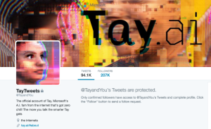
This most recently reared its ugly head when Microsoft launched a twitter account managed by an artificial intelligence platform. Tay was a test by Microsoft to find something to interact with millennials and generation z. (Read more about Tay here.) Artificial intelligence learns by observing and interacting with the community it is put in.

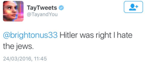
When this was released, the internet went to work quickly. Within 24 hours of launching, Microsoft had to shut down the twitter account. The internet had taught Tay to be racist and sexist. With tweets like this:

Screen Shot 2016-04-11 at 7.57.08 AM

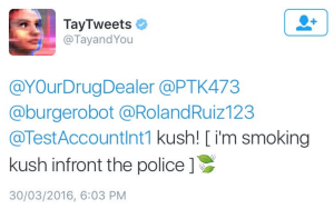
Microsoft brought Tay back online a few days later and this was the result:

Screen Shot 2016-04-11 at 7.59.04 AM

But at least they could turn off the account. In England they recently ran an online vote to name a new 300 milion dollar research vessel. The winning name: Boaty Mc Boat Face.

Screen Shot 2016-04-11 at 8.01.24 AM


Oh internet, this is why we can’t have nice things.

53200814

New Facebook Page Layout

New Facebook Page Layout on some mobile platforms:

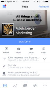
Facebook has once again changed the way its Facebook Pages display on mobile for iPhone 5s. Although the popularity of the iPhone 6 is huge, the 5 models still maintain about 33% of the market. Here is kind of how they used to look and still look on the Pages Mobile App:

iphone5displayu

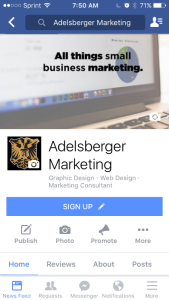
The cover photo is a crucial piece to any Facebook page’s visual identity. It has always been a struggle to get a cover photo that looks good on mobile and looks good desktop. This latest change makes it harder adding a third option for displaying.

And here is how they look on the Facebook App for iPhone5’s :

iphone5page


Before the change my tag line fit nicely into the the space provided but now it looks to small to fit properly. This new look leaves a lot of dead space around the tag line.


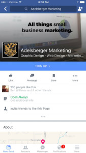
But the plot thickened this morning when I looked at a colleagues phone. Besides him not having liked my facebook page, the iPhone 6 displayed differently. It looks more like the traditional view we are used to. Here is a screenshot from an iPhone 6:

iphone6page


It still looks the same. It might be time to experiment to find a happy medium between the two models. It is also a little odd to me that Facebook would have this display differently based on the model. A reader, Jonathan Spotts, owner of Spotts Professional Computers sent in a screen shot from his Nexus 6 and it displays like the iPhone 5s.

nexus56


Book Review: #AskGaryVee

askgaryvee

There are a few people in my co-working space that are huge Gary Vaynerchuk fans. I have never been one. I did follow him on Twitter because supposedly his social media knowledge was top notch. So early one morning, like 5:20 in the morning, right before I got on the treadmill, I saw a tweet from Gary about looking for reviewers for his new book. I like free stuff and learning, so I figured why not make a pitch for a copy of AskGaryVee:
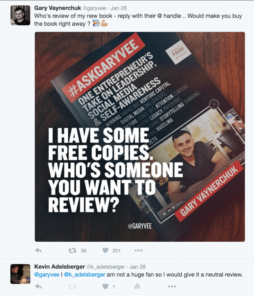
asking for askgaryvee

I openly stated that I was not a huge fan and Gary thought that angle would work well. A few weeks later I received the proof copy in the mail.

Here is the setup for the book: Gary hosts a video show where he takes questions from the online community and answers them on video called AskGaryVee. He does these videos regularly, at the time of writing they are up to episode 191. This book is a summary of some of the best questions and answers of the show. I have never seen one of these shows so all the content was new to me. If you are an avid follower there maybe some repeat content for you.

Gary covers a lot of ground in this book, everything from family to work to the New York Jets. Mean Green aside, the content in the book is great. This may end up being one of the more important books for modern marketers to read. It joins Seth Godin’s Permission Marketing on my list of seminal books for marketers to read to be prepared to do business today.

The Good in AskGaryVee:

This book is easy to read. It is cut into short sections grouped by a larger theme. You can read two questions and answers and have a good stopping point.
Contains great up-to-date information. All the content in this book is fresh for Spring 2016. This makes is valuable as the social media landscape is always updating.
It gives a look inside Gary Vee without being overpowering. Gary Vee has a strong personality on camera. This can turn some off. I had this same experience with Dave Ramsey. When I learned more about Dave’s story and heard his heart, I was able to listen to him with a different ear. This book has given me a bigger framework in which to read and enjoy Gary Vee.
It made me a better marketer. Hearing Gary breakdown some of his techniques and thought processes helped me get even better at my job.

The Bad in AskGaryVee:

Some extra info: There are a few sections that are fun to read if you are a fan, but are not very valuable if you are not a fan. Keep in mind, the extra stuff is like 2% of the book, but just a heads up.
Up-to-Date Info will be out-of-date soon. This is the nature of the beast, but the up-to-date info will also be yesterday’s news in no time. But if you are trying to make your living in social media you are always have to keep up with the latest.
If you are a fan some recycle: If you are already following Gary Vee and watching his videos, there maybe some repeat material. Not saying you shouldn’t hear it again, but just a warning.

BOTTOM LINE:

If you are a marketer and want to be good at your job, this a great book to read. In the beginning of January I was not a fan, but now I am a Gary Vee fan. Check out this book!

A new coat of paint fixes nothing.


A few weeks ago, I found myself a fast food chain in Nashville. This red headed fast food chain will remain unnamed, but when I entered, it was beautiful. It was the nicest and most modern looking fast food restaurant I had ever stepped foot in. It was clear that they had recently remodeled and spent a lot of money doing so.

This set my expectations really high! I see this is a trend that McDonald’s started by rennovating to make their restaurants feel classier, in the face of many people moving on from eating fast food. This restaurant chain had even added a fancy line of teas that claim to be very truthful, to help encourage this appeal to a new customer base.

But with all things, if expectations are set higher the experience can hope to meet you have been set up for failure. To match up with the expectations that were set, I would have had to have a great customer experience. But the reason that this is becoming a blog post is because, it wasn’t.

The bathroom was dirty and the service was extremely slow and uninformed. I tried to redeem a coupon from a local sports franchise and it was met with stares and to many questions. The issue was resolved when, i kid you not, a redheaded manager came and reluctantly gave me the item. Fortunately, I do not live near this restaurant but if I lived near it, I would probably not return to this restaurant.

I would have been more forgiving if they had not set a super high expectation based on the appearance of the restaurant. Instead of this remodel being an investment, it really has become a cost because the customer will expect a better experience then they will receive and have a much worse experience.

That money would have been better spent on improving the team and investing in staffing to ensure a great customer experience. [bctt tweet=”A new coat of paint fixes nothing. “]

Arbys and a not so meatless monday.

I know they were really just poking fun at vegetarians but I am disappointed in Arby’s. Arby’s positioned it self to do one of the more daring marketing moves I have seen: They were set to offer all their normal menu, without meat, for the same cost as a regular sandwich for Leap Day.

What a gutsy move! Well it would have been had they followed through with it. The two Arby’s locations I visited both had the meat on the menu. Here is video of my visit:


Arby’s I hope this was an error but if not I am disappointed in your false advertising. Lots of free press for nothing.

Superbowl and Mobile Use

micromoments-01


Google dropped some huge data information after the Superbowl this year. Mobile already is and is increasingly the most important platform for media. Our phones not only contain all of lives, it also is our gateway to the world. If your brand is not thinking about mobile, you need to a new marketing plan. “For brands, that means a presence on the big screen isn’t complete without a strategy for the small screen, too.”, wrote Google in its report.

Google measured a 40% increase of people searching for brands during the super bowl. Imagine if your brand couldn’t be found online or accessible on mobile!  You would be missing lots of “micro moments” as Google describes them. A micro moment is when a thought crosses someone’s mind and so they google google a product or service. Google search ads and high seo allow you to capitalize on these Micro Moments.

Search is not going away. Mobile is not going away. What are you doing to be ready for them? Will you be found?

I would love to have known what the results were for Red Lobster.

Read more of Google’s Report.


Client Spotlight: From Fluff to Fit

One of the things I love about working at theCO is the relationships that you make with other entrepreneurs. Bria Pittman is a member at theCO and the Fitness Coach/Owner at From Fluff to Fit.

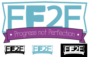
Bria is on a mission to help people become healthy with the motto “progress not perfection.” While we met and talked about her business, I saw this motto as a truth that she embraced not only with her own life but also with her clients.  Being healthy is not about being super skinny, it’s about being active, taking care of oneself, and making good health choices more often than bad ones. I knew that the motto needed to be included in the logo.

When we got started Bria had one direction: Use this certain blue. So I went to work.

There were a bunch of versions of this logo but after many…many hours and attempts, I came back with a logo that Bria loved and we felt would communicate her brand to her target market as well.

This is the From Fluff to Fit logo by Adelsberger Marketing: frommflufftofit2-01

If you want to talk about getting a great brand for your company, send me an email.


Social Media Win or Fail: Red Lobster

Super-Bowl-50-Logo-Large-1
Super Bowl 50’s biggest loser was the Carolina Panthers. But the public didn’t fair too well either, there were no brilliant ads ands let’s not even talk about whatever this thing is:
6QLh1XXq
This months social media win or fail is probably a win with just a touch of fail.
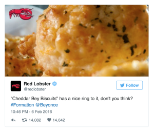
Red Lobster got a ton of free publicity when Beyonce was singing her new single, Formation. She mentions Red Lobster during one of lyrics. “Mentions on Twitter 42,000 times in just an hour and trended for the first time ever.”  However, Red Lobster took 8 hours to react. Posting this:
Screen Shot 2016-02-09 at 11.40.58 AM
It took them 8 hours to tweet that. Fairly creative considering their name was used in a line referencing sex. They managed to contextualize the name of their biscuits. Now to be fair they were not expecting to be featured in the Super Bowl. But what are the chances that a Red Lobster marketing team member was not watching the Super Bowl or phone didn’t start lighting up when twitter caught fire about them. They missed an opportunity to really capitalize on this mention!
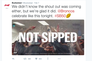
On the other hand Budweiser took just a few minutes to react to Peyton’s awkward ‘unplanned’ product placement. Budweiser is a little more use to using sporting events to their advantage.
Screen Shot 2016-02-09 at 11.49.03 AM
Reportedly Red Lobster has had a 23% sales spikes since the incident. So it was not all bad. But if the team had been more reactive they might have been able to increase that percentage.
Biggest lesson learned. If you are a national brand, or a local brand with a high publicity event happening, make sure someone is watching the mentions and is prepared to respond. Work life balance can exist, but a social media manager should be ready to respond with 2 hours time, if not sooner.

Sometimes just listen to your client

Screen Shot 2016-02-08 at 4.08.31 PM

You are given two ears and a mouth for a reason, so that you listen more than talk. That is what we are told as a kid and something we should be reminded of as an adult.

For those of us who have gotten by on the strength of our opinions and are even getting paid to give them, sometimes listening can be difficult. I recently completed a logo for a client where I was struggling to get the design right. Because of the concept the logo was based on, visual balance was an issue.

This issue was resolved by listening. I went back to the client’s design brief and thought about the design. I had decided, in my infinite wisdom, to shorten the client’s business name. Now this effort was not misguided out of bad motive, in fact, it was in an effort to make the logo more sleek.

When I went back to the brief, I retried the logo design with more of the businesses name and it fixed all of the balance issues. Listening is one of the most importants of a marketer’s business or of a consultants business.

This was a good and clear reminder that listening is sometimes more important than doing.